Slider
super: UISlider (on iOS)
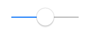
A Slider object is a visual control used to select a single value from a continuous range of values. Sliders are always displayed as horizontal bars. An indicator, or thumb, notes the current value of the slider and can be moved by the user to change the setting.
Events
-
Load() This event is called when the object becames available in the current runtime system.
-
WillShow() The view is about to be added to the App's views hierarchy.
-
WillHide() The view is about to be removed from the App's views hierarchy.
-
Changed(value: Float) Use this event to be notified when value changes.
-
DidShow() The view has been added to the App's views hierarchy.
-
DidHide() The view has been removed from the App's views hierarchy.
-
Unload() This event is called when the object has been removed from the current runtime system (but not yet deallocated).
Properties
-
var value: Float Contains the receiver’s current value.
-
var minimumValue: Float Contains the minimum value of the receiver.
-
var maximumValue: Float Contains the maximum value of the receiver.
-
var continuous: Bool Contains a Boolean value indicating whether changes in the sliders value generate continuous update events.
-
var minimumValueImage: Image Contains the image that is drawn on the side of the slider representing the minimum value.
-
var maximumValueImage: Image Contains the image that is drawn on the side of the slider representing the maximum value.
-
var minimumTrackTintColor: Color The color used to tint the standard minimum track images.
-
var maximumTrackTintColor: Color The color used to tint the standard maximum track images.
-
var thumbTintColor: Color The color used to tint the standard thumb images.
-
var currentMinimumTrackImage: Image Contains the minimum track image currently being used to render the receiver. (read-only)
-
var currentMaximumTrackImage: Image Contains the maximum track image currently being used to render the receiver. (read-only)
-
var currentThumbImage: Image Contains the thumb image currently being used to render the receiver. (read-only)
-
var objectName: String The name of the object.
Methods
-
func setValueAnimated(value: Float, animated: Bool = true) Sets the receiver’s current value, allowing you to animate the change visually.
-
func minimumTrackImageForState(state: ControlState): Image Returns the minimum track image associated with the specified control state.
-
func setMinimumTrackImageForState(image: Image, state: ControlState) Assigns a minimum track image to the specified control states.
-
func maximumTrackImageForState(state: ControlState): Image Returns the maximum track image associated with the specified control state.
-
func setMaximumTrackImageForState(image: Image, state: ControlState) Assigns a maximum track image to the specified control states.
-
func thumbImageForState(state: ControlState): Image Returns the thumb image associated with the specified control state.
-
func setThumbImageForState(image: Image, state: ControlState) Assigns a thumb image to the specified control states.
-
func animate(duration: Float, delay: Float, options: AnimationOption, animations: Closure, completion: Closure) Animate changes to one or more views using the specified duration, delay, options and completion handler.
-
func setFocus() Force focus to be set to the selected control. For TextField and TextView that means force Keyboard to appear.
-
func clearFocus() Clear focus from selected control
Enums
ControlState
- .Application
- .Disabled
- .Focused
- .Highlighted
- .Normal
- .Selected
AnimationOption
- .AllowAnimatedContent
- .AllowUserInteraction
- .Autoreverse
- .BeginFromCurrentState
- .CurveEaseIn
- .CurveEaseInOut
- .CurveEaseOut
- .CurveLinear
- .LayoutSubviews
- .OverrideInheritedCurve
- .OverrideInheritedDuration
- .OverrideInheritedOptions
- .Repeat
- .ShowHideTransitionViews
- .TransitionCrossDissolve
- .TransitionCurlDown
- .TransitionCurlUp
- .TransitionFlipFromBottom
- .TransitionFlipFromLeft
- .TransitionFlipFromRight
- .TransitionFlipFromTop
- .TransitionNone