Carousel
Carousel is a class designed to simplify the implementation of various types of carousel (paged, scrolling views). Carousel implements a number of common effects such as cylindrical, flat and CoverFlow style carousels, as well as providing hooks to implement your own bespoke effects. Carousel can work with any kind of view, not just images, so it is ideal for presenting paged data in a fluid and impressive way in your app. It also makes it extremely easy to swap between different carousel effects with minimal code changes.
Best practices
- Carousel can work with any kind of view. Not just images, so it is ideal for presenting paged data in a fluid and impressive way in your app.
How to use
- Drop a
Carouselcontrol from the object panel to aWindow - Use the
Carousel Inspectorto customize its properties likeType,Perspective,SpacingandDataSet
If you need to write code for Carousel:
- Open the
Code Editor - Select the
DidSelectCellitem inside theEventsarea and write your custom code in theCode Editor
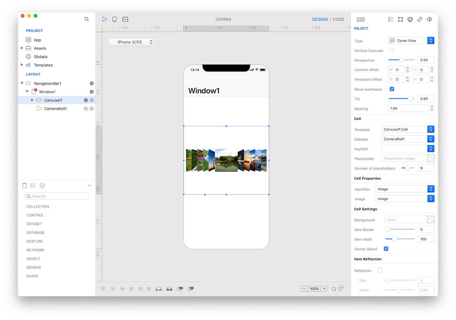
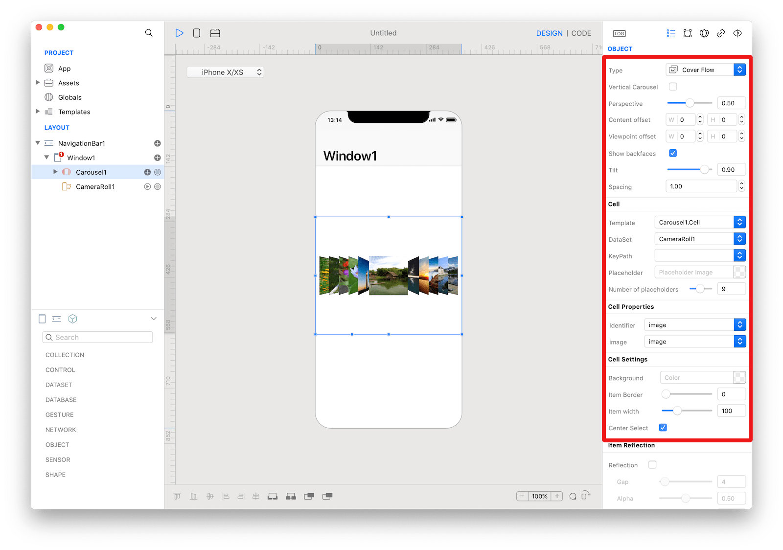 The inspector where the
 Carousel class can be configured.
How to customize
The Carousel can be customized by tapping the subnode icons (+).
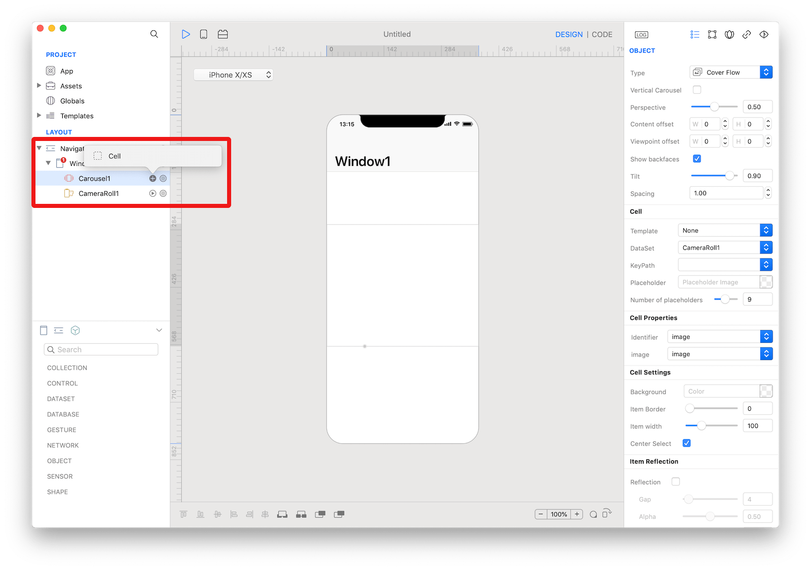 The
The Carousel customizations.
CarouselCell
A CarouselCell for placement on a Carousel that can be configured by dropping a control like ImageView and Label.
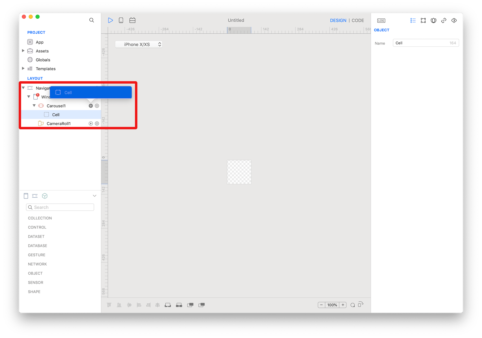 The
The Carousel cell.
Example
- Drop a
Slidercontrol from the object panel to aWindow - Open the
Code Editor - Select the
Changeditem inside theEventsarea and write your custom code in theCode EditorCarousel1.currentItemIndex = Slider1.value - Drop a
Buttoncontrol from the object panel to aWindow - Open the
Code Editor - Select the
Actionitem inside theEventsarea and write your custom code in theCode EditorSlider1.maximumValue = Carousel1.numberOfItems
Most important properties
Several UI aspects can be configured in the Carousel class but the type, currentItemIndex, and numberOfItems are the most commons to be configured.
type: Used to switch the carousel display type.currentItemIndex: The index of the currently centered item in the carousel. Setting this property is equivalent to calling scrollToItemAtIndex with the animated argument set to false.numberOfItems: The number of items in the carousel (read only). Note that not all of these item views will be loaded or visible at a given point in time - the carousel loads item views on demand as it scrolls.
References
Carousel class reference contains a complete list of properties and methods that can be used to customize a Carousel object.