TextField
A text field is a single-line, fixed-height field, often with rounded corners, that automatically brings up a keyboard when the user taps it. Use a text field to request a small amount of information, such as an email address.
Best practices
- Show a hint in a text field to help communicate purpose. A text field can contain placeholder text—such as "Email" or "Password"—when there’s no other text in the field. Don’t use a separate label to describe a text field when placeholder text is sufficient.
- Display a Clear button in the right end of a text field when appropriate. When this element is present, tapping it clears the contents of the text field, eliminating the need to keep tapping the Delete key.
- Use secure text fields when appropriate. Always use a secure text field when your app asks for sensitive data, such as a password.
- Use images and buttons to provide clarity and functionality in text fields. You can display custom images in the left or right sides of a text field, or you can add a system-provided button, such as the Bookmarks button. In general, use the left end of a text field to indicate a field’s purpose and the right end to indicate the presence of additional features, such as bookmarking.
How to use
- Drop a
TextFieldcontrol from the object panel to aWindow - Use the
TextField Inspectorto customize its properties likeText,Placeholder, andKeyboard Type
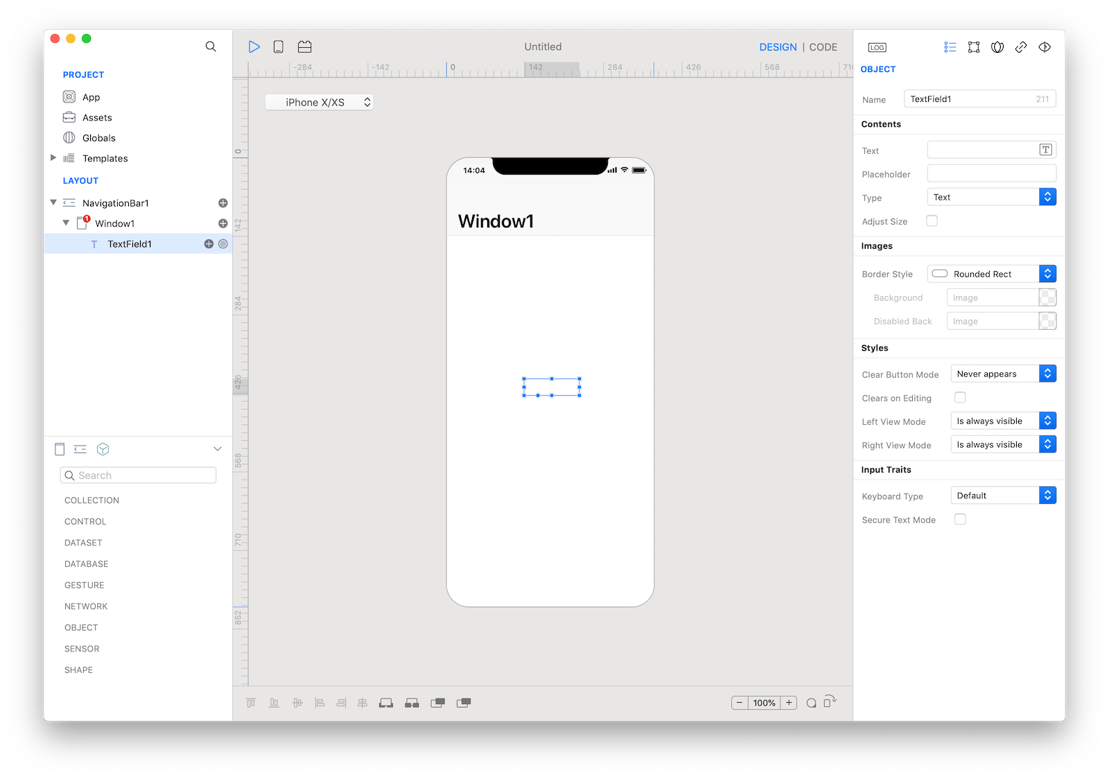
 The inspector where the
 TextField class can be configured.
How to customize
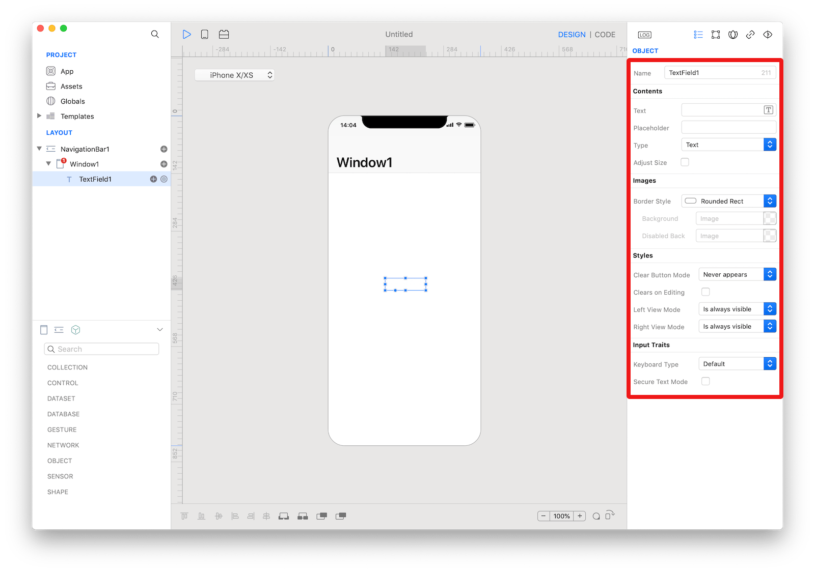
The TextField can be customized by tapping the subnode icons (+).
 The
The TextField customizations.
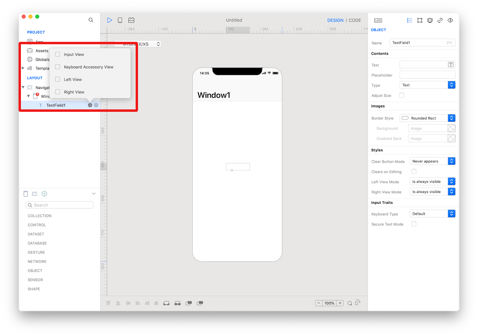
Input View
The custom input view to display when the text field becomes active. The user can drop one or more controls in order to create the custom input view.
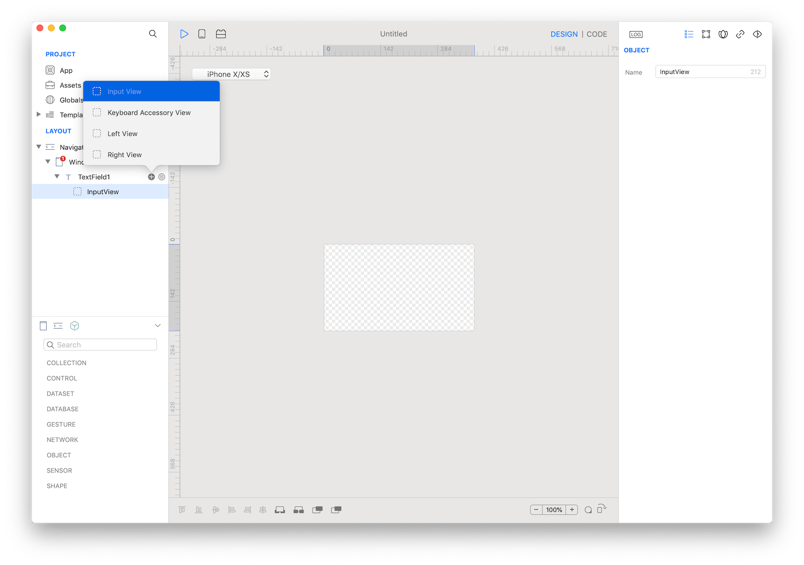 The
The TextField input view customization.
Keyboard Accessory View
The custom accessory view to display when the text field becomes active. The user can drop one or more controls in order to extend the default keyboard.
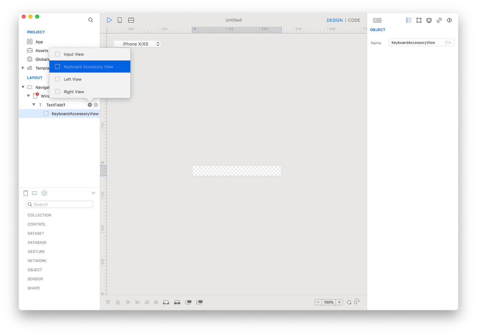 The
The TextField keyboard accessory view customization.
Left View
The overlay view displayed on the left (or leading) side of the text field.
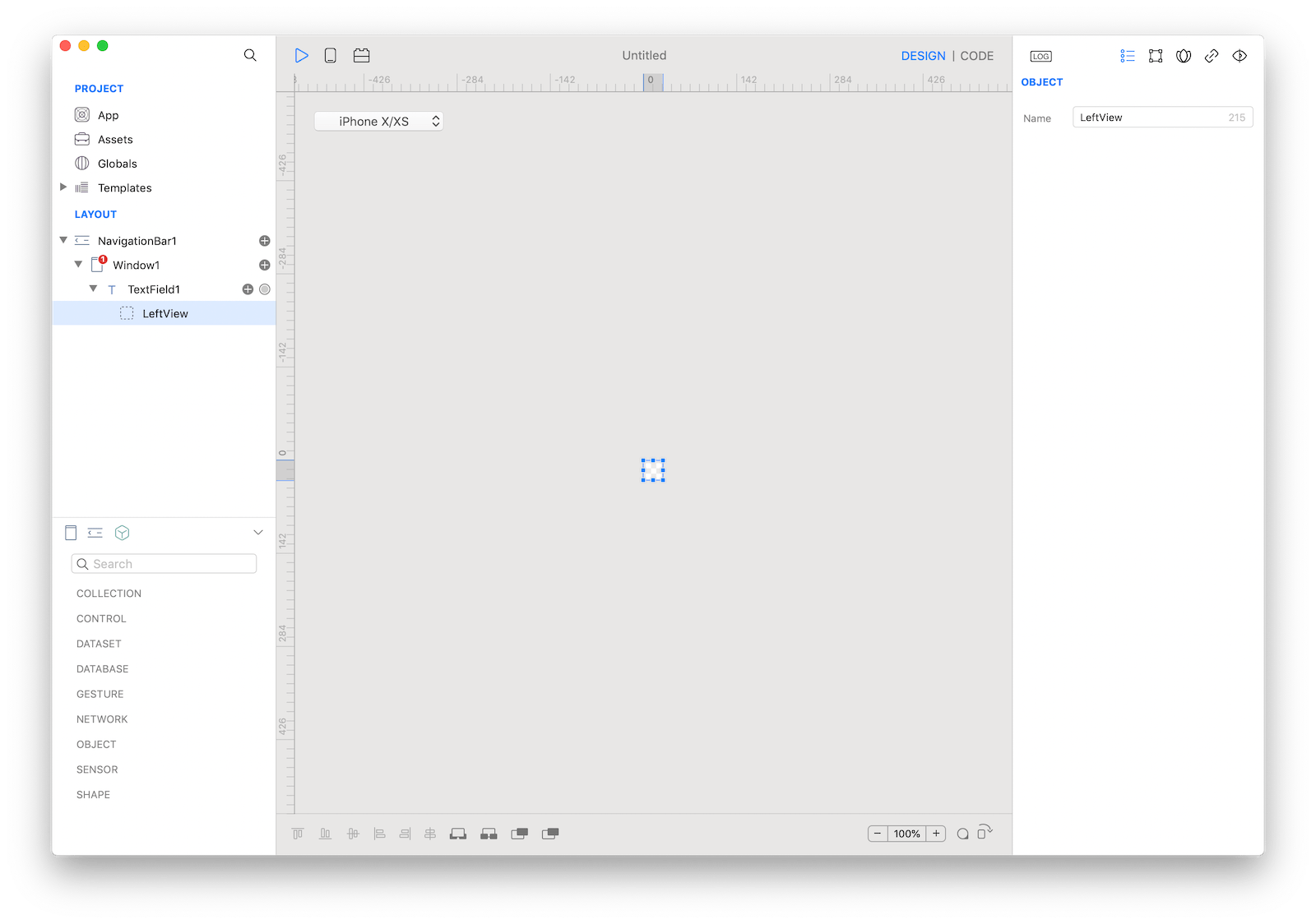 The
The TextField left view customization.
Right View
The overlay view displayed on the right (or trailing) side of the text field.
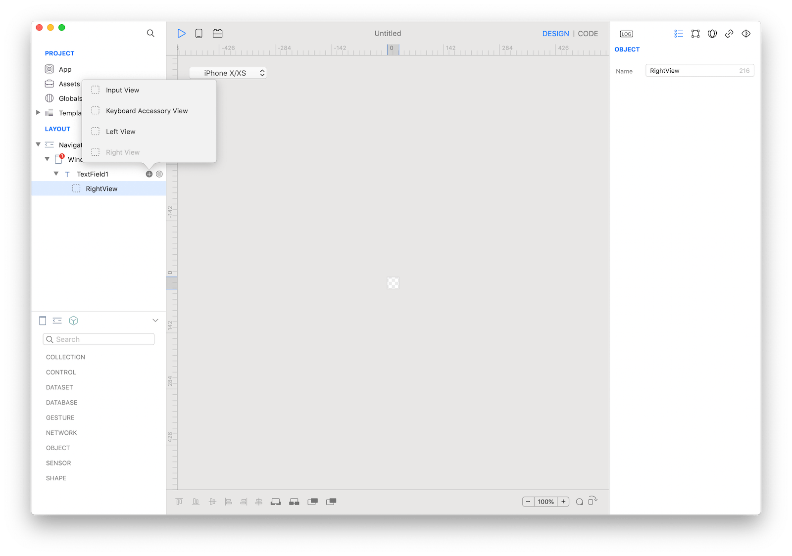 The
The TextField right view customization.
Example
- Drop a
Buttoncontrol from the object panel to aWindow - Open the
Code Editor - Select the
Actionitem inside theEventsarea and write your custom code in theCode EditorTextField1.text = "Text"
Most important properties
Several UI aspects can be configured in the TextField class but the text, textColor, textAlignment and nextField are the most commons to be configured.
text: The text displayed by the text field.textColor: The color of the text.textAlignment: The technique to use for aligning the text.nextField: Configures the next field to activate, or nil if there is no next field.
References
TextField class reference contains a complete list of properties and methods that can be used to customize a TextField object.