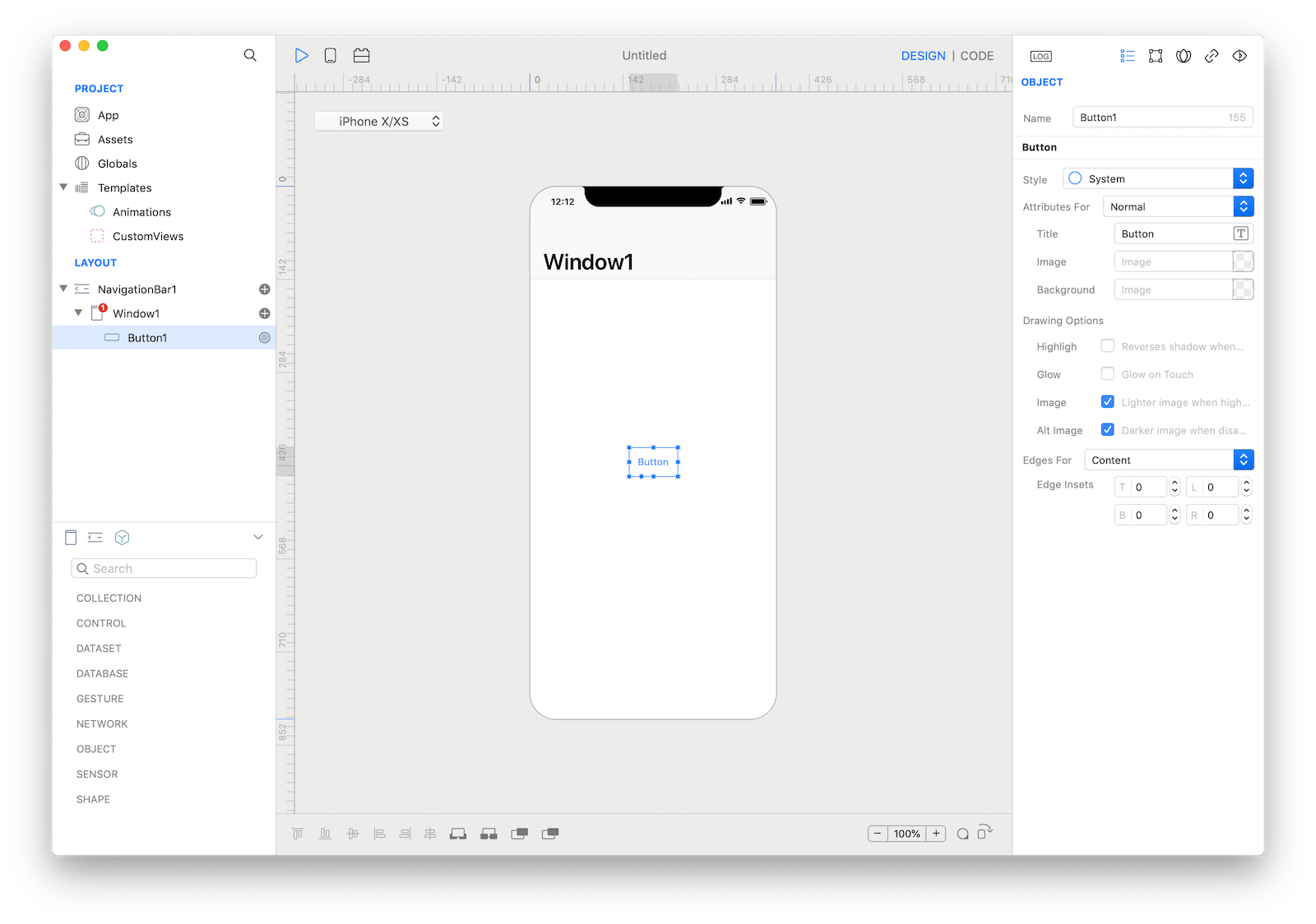
Button
Buttons initiate app-specific actions, have customizable backgrounds, and can include a title or an icon. The system provides a number of predefined button styles for most use cases. You can also design fully custom buttons.

Best practices
- Use verbs in titles. An action-specific title shows that a button is interactive and says what happens when you tap it.
- Use title-case for titles. Capitalize every word except articles, coordinating conjunctions, and prepositions of four or fewer letters.
- Keep titles short. Overly long text can crowd your interface and may get truncated on smaller screens.
- Consider adding a border or a background only when necessary. By default, a system button has no border or background. In some content areas, however, a border or background is necessary to denote interactivity. In the Phone app, bordered number keys reinforce the traditional model of making a call, and the background of the Call button provides an eye-catching target that’s easy to hit.
How to use
- Drop a
Buttoncontrol from the object panel to aWindow - Use the
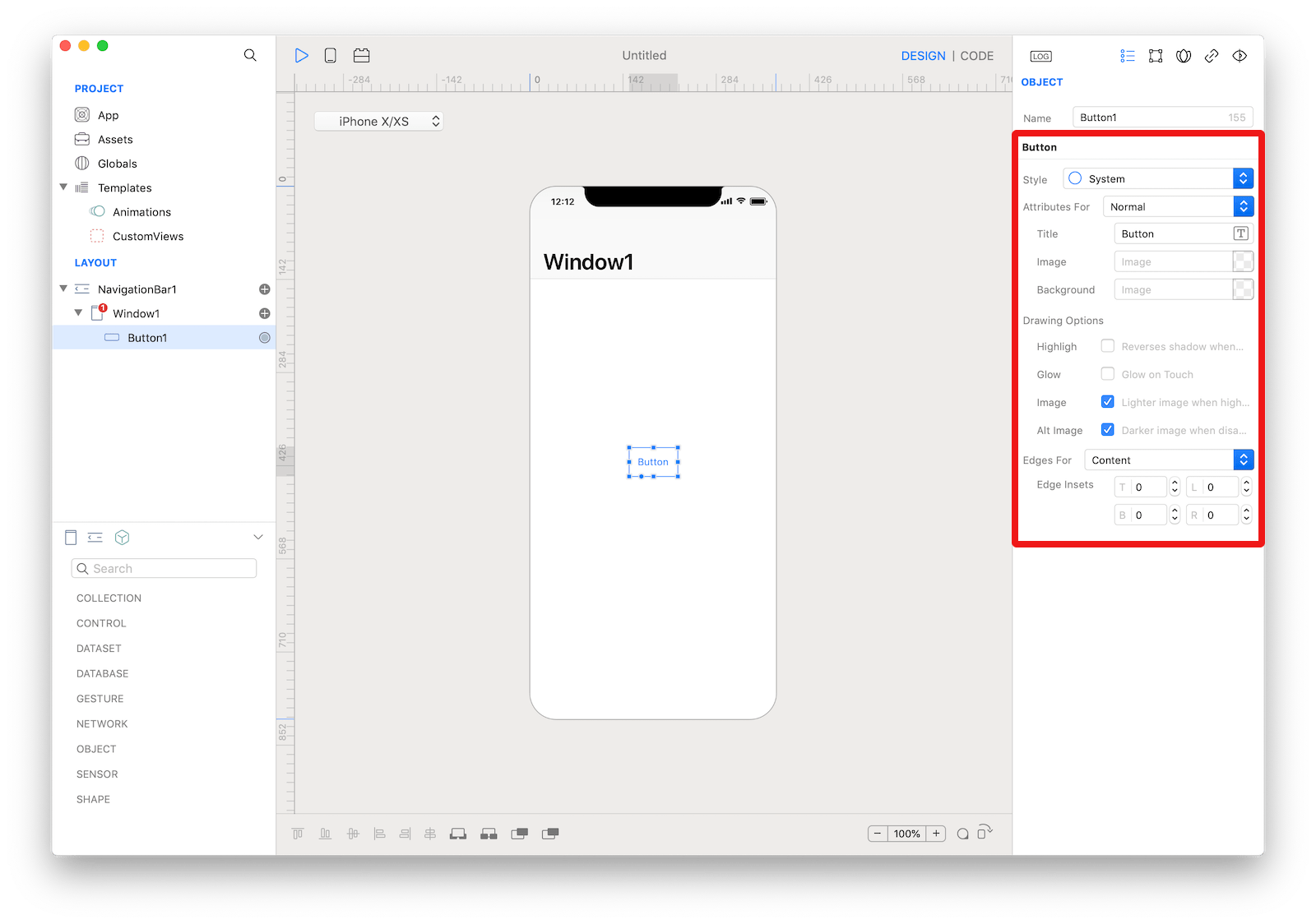
Button Inspectorto customize its properties likeTitleandStyle
If you need to write code for Button:
- Open the
Code Editor - Select the
Actionitem inside theEventsarea and write your custom code in theCode Editor
 The inspector where the
 Button class can be configured.
Example
- Open the
Code Editor - Select the
Actionitem inside theEventsarea and write your custom code in theCode Editorvar alert = Alert("Title", "Message") alert.show()
Most important properties
Several UI aspects can be configured in the Button class but the Title and Style are the most commons to be configured.
Title: You can specify a button’s title and customize its typographic properties.Style: Specifies the style of a button.
 The
The Button styles.
References
Button class reference contains a complete list of properties and methods that can be used to customize a Button object.