OvalShape
Represents an oval shape.
How to use
- Drop a
OvalShapecontrol from the object panel to aWindow - Use the
OvalShape Inspectorto customize its properties likeThickness,Border Color, andFill Color
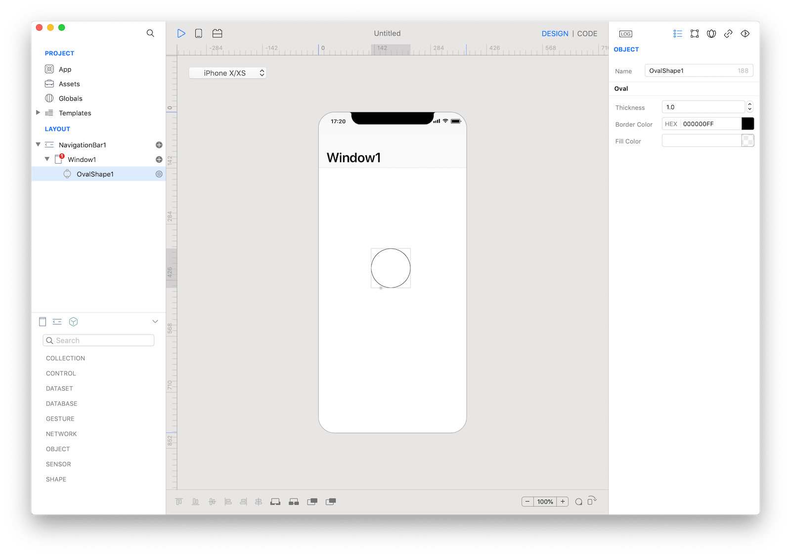
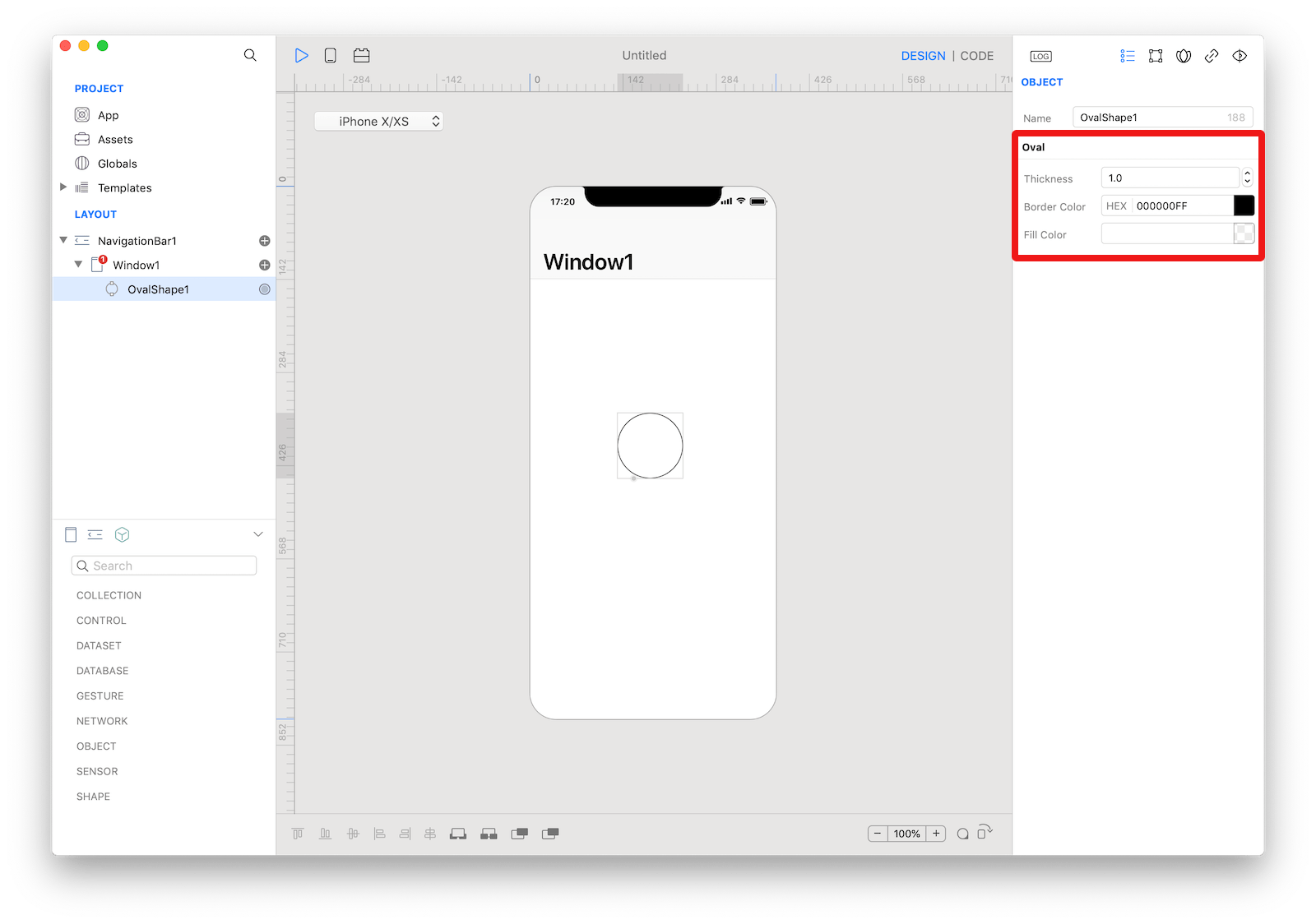 The inspector where the
 OvalShape class can be configured.
Example
- Drop a
Buttoncontrol from the object panel to aWindow - Open the
Code Editor - Select the
Actionitem inside theEventsarea and write your custom code in theCode EditorOvalShape1.fillColor = Color.red OvalShape1.strokeColor = Color.black OvalShape1.strokeThickness = 4
Most important properties
Several UI aspects can be configured in the OvalShape class but the fillColor, strokeColor, and strokeThickness are the most commons to be configured.
fillColor: Color used to fill the shape.strokeColor: Color used to stoke shape border.strokeThickness: Border thickness.
References
OvalShape class reference contains a complete list of properties and methods that can be used to customize a OvalShape object.