RectShape
Represents a rectangle shape (with optional rounded corners).
How to use
- Drop a
RectShapecontrol from the object panel to aWindow - Use the
RectShape Inspectorto customize its properties likeFill Color,Thickness,Radius, andBorder Color
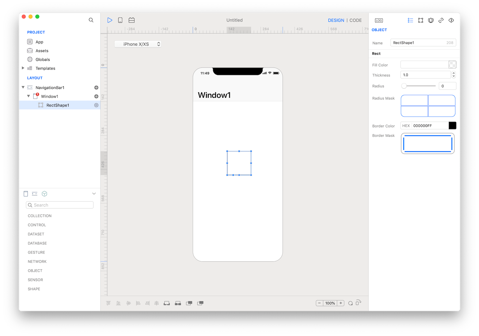
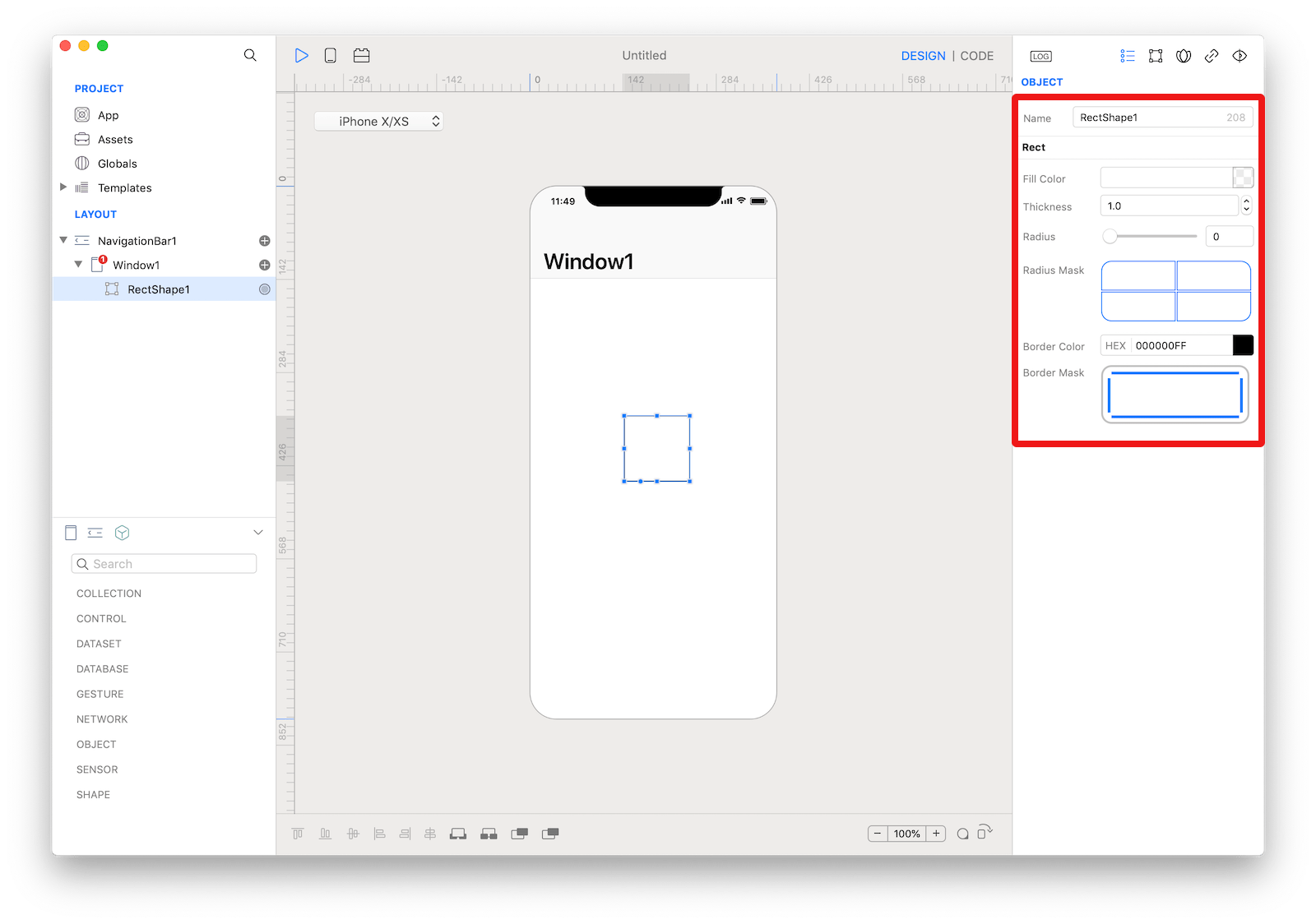 The inspector where the
 RectShape class can be configured.
Example
- Drop a
Buttoncontrol from the object panel to aWindow - Open the
Code Editor - Select the
Actionitem inside theEventsarea and write your custom code in theCode EditorRectShape1.fillColor = Color.red RectShape1.borderColor = Color.black RectShape1.borderWidth = 4
Most important properties
Several UI aspects can be configured in the RectShape class but the radius, fillColor, borderColor and borderWidth are the most commons to be configured.
radius: Radius value in case of rounded rect.fillColor: Color used to fill the shape.borderColor: The color of the view’s border.borderWidth: The width of the view's border. When this value is greater than 0.0, the layer draws a border using the current borderColor value. The border is drawn inset from the receiver’s bounds by the value specified in this property. It is composited above the receiver’s contents and sublayers and includes the effects of the cornerRadius property.
References
RectShape class reference contains a complete list of properties and methods that can be used to customize a RectShape object.