TextView
A text view displays multiline, styled text content. Text views can be any height and enable scrolling when the content extends outside of the view. By default, content within a text view is left-aligned and uses the system font in black. If a text view is editable, a keyboard appears when you tap inside the view.
Best practices
- Keep text legible. Although you can use multiple fonts, colors, and alignments in creative ways, it’s essential to maintain the readability of your content. It’s a good idea to adopt Dynamic Type so your text still looks good if people change text size on their device. You should also test your content with accessibility options enabled, such as bold text.
- Show the appropriate keyboard type. iOS provides several different keyboard types, each designed to facilitate a different type of input. To streamline data entry, the keyboard displayed during the editing of a text view should be appropriate for the type of content in the field.
How to use
- Drop a
TextViewcontrol from the object panel to aWindow - Use the
TextView Inspectorto customize its properties likeText,Enable Scrolling, andAllows Editing
If you need to write code for TextView:
- Open the
Code Editor - Select the
Changeditem inside theEventsarea and write your custom code in theCode Editor
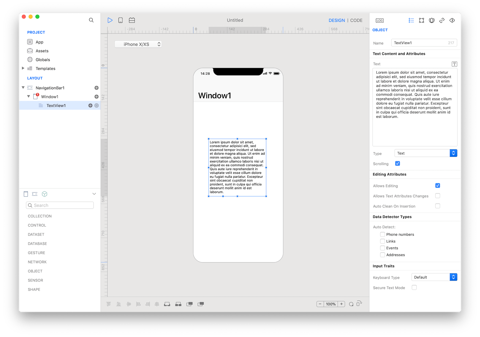
 The inspector where the
 TextView class can be configured.
How to customize
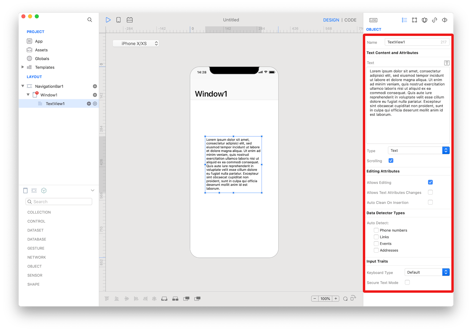
The TextView can be customized by tapping the subnode icons (+).
 The
The TextView customizations.
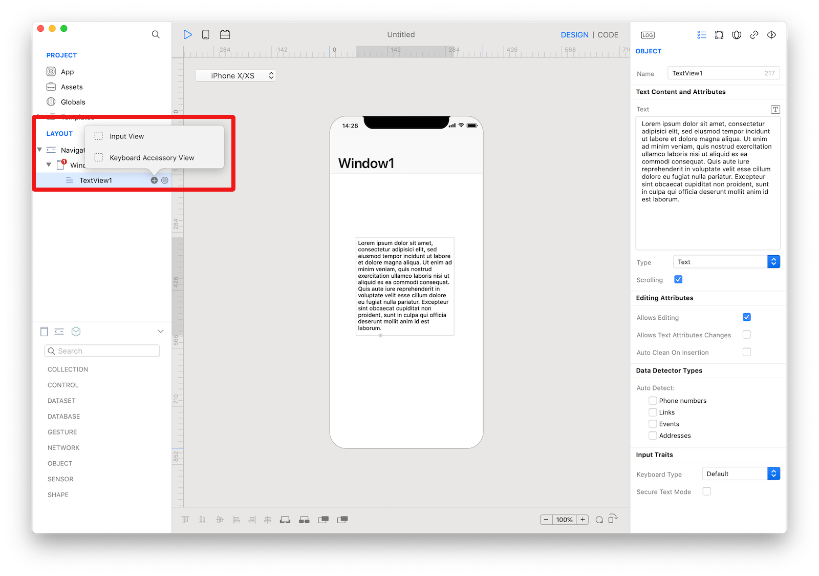
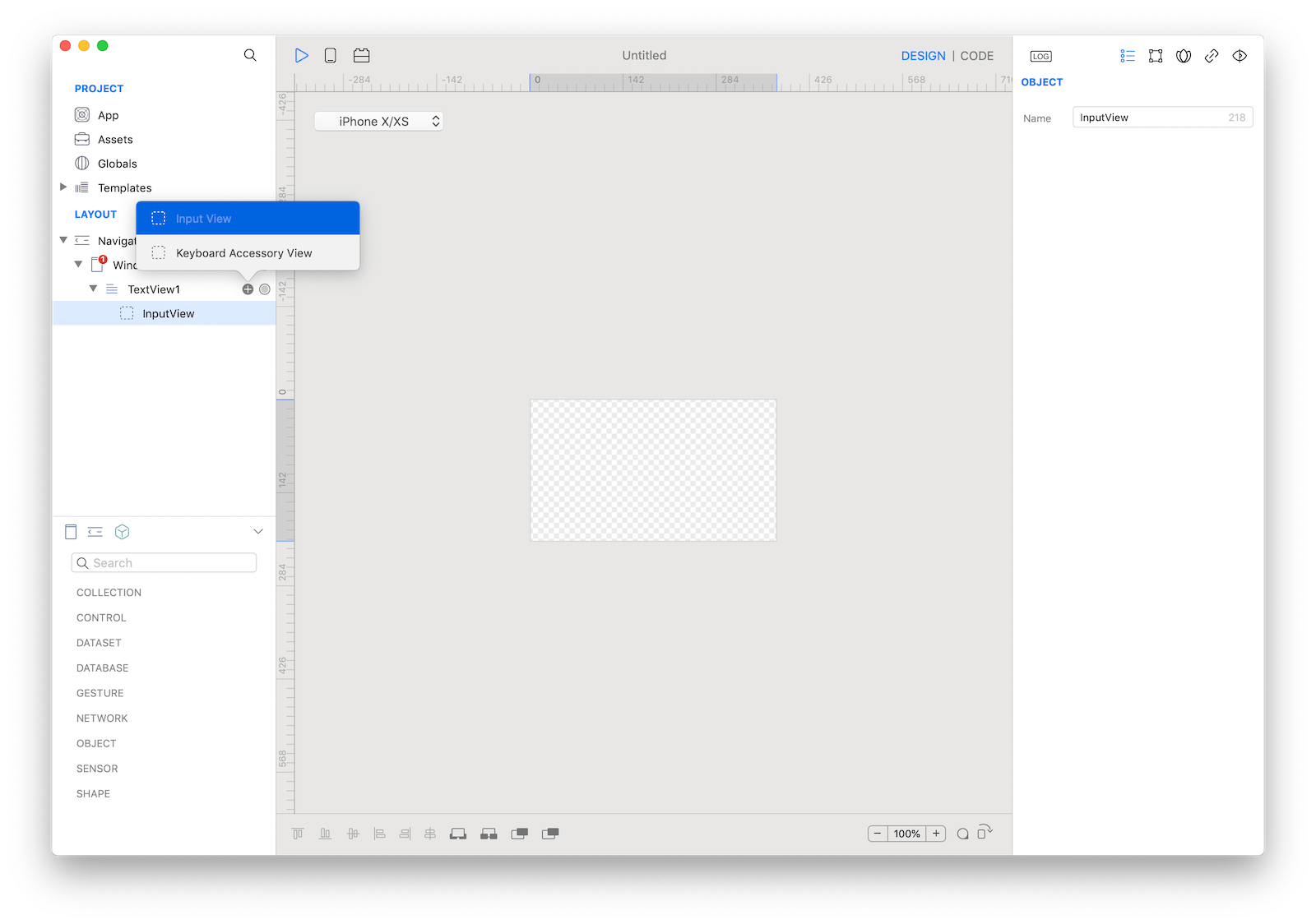
Input View
The custom input view to display when the text view becomes active. The user can drop one or more controls in order to create the custom input view.
 The
The TextView input view customization.
Keyboard Accessory View
The custom accessory view to display when the text view becomes active. The user can drop one or more controls in order to extend the default keyboard.
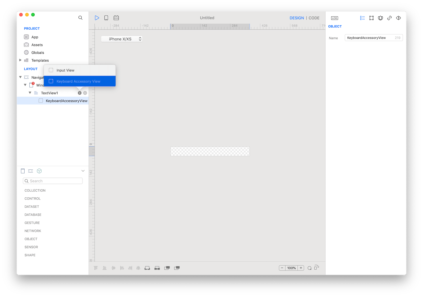 The
The TextView keyboard accessory view customization.
Example
- Drop a
Buttoncontrol from the object panel to aWindow - Open the
Code Editor - Select the
Actionitem inside theEventsarea and write your custom code in theCode EditorTextView1.text = "Text"
Most important properties
Several UI aspects can be configured in the TextView class but the text, textColor, and editable are the most commons to be configured.
text: The text displayed by the text view.textColor: The color of the text.editable: A Boolean value indicating whether the receiver is editable.
References
TextView class reference contains a complete list of properties and methods that can be used to customize a TextView object.