Slider
A slider is a horizontal track with a control called a thumb, which you can slide with your finger to move between a minimum and maximum value, such as screen brightness level or position during media playback. As a slider’s value changes, the portion of track between the minimum value and the thumb fills with color. A slider can optionally display left and right icons that illustrate the meaning of the minimum and maximum values.
Best practices
- Customize a slider’s appearance if it adds value. A slider’s appearance, including track color, thumb image, and left and right icons, can be adjusted to blend with your app’s design and to communicate intent. A slider that adjusts image size, for example, could show a small image icon on the left and a large image icon on the right.
How to use
- Drop a
Slidercontrol from the object panel to aWindow - Use the
Slider Inspectorto customize its properties
If you need to write code for Slider:
- Open the
Code Editor - Select the
Changeditem inside theEventsarea and write your custom code in theCode Editor
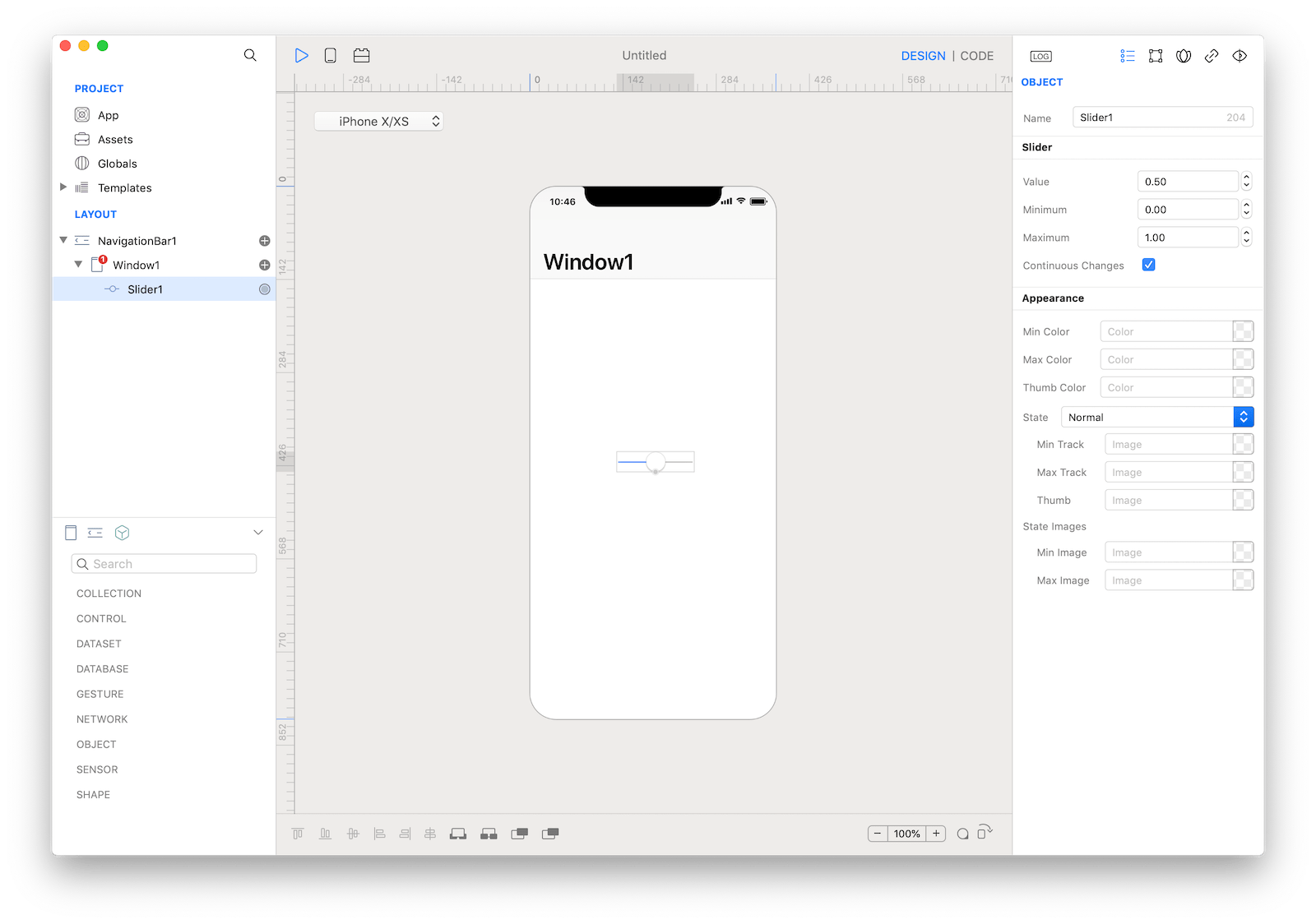
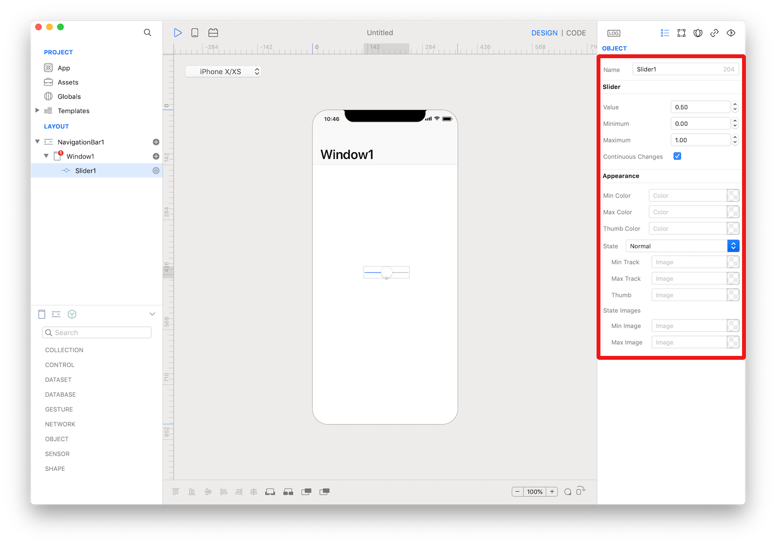 The inspector where the
 Slider class can be configured.
Example
- Open the
Code Editor - Select the
Changeditem inside theEventsarea and write your custom code in theCode EditorConsole.write("Slider value: \(self.value)")
Most important properties
Several UI aspects can be configured in the Slider class but the values related properties are the most commons to be configured.
Value: The slider’s current value.Maximum: The maximum value of the slider.Minimum: The minimum value of the slider.
References
Slider class reference contains a complete list of properties and methods that can be used to customize a Slider object.