ProgressView
A progress view includes a track that fills from left to right to show the progression of a task with a known duration. Progress views are noninteractive, although they are often accompanied by a button for canceling the corresponding operation.
Best practices
- Always report progress accurately. Don’t display inaccurate progress information just to make your app appear busy. Only use progress views for tasks that are quantifiable. Otherwise, use an activity indicator.
- Use progress views for tasks with a well-defined duration. Progress views are great for showing the status of a task, especially when it helps convey how much longer the task needs to complete.
- Hide the unfilled portion of track in navigation bars and toolbars. By default, a progress view’s track includes both filled and unfilled portions. When used in a navigation bar or toolbar, such as to denote a page loading, a progress view should be configured to hide the unfilled portion of the track.
- Consider customizing a progress view’s appearance to match your app. A progress view’s appearance can be adjusted to match your app’s design. You can specify, for example, a custom tint or image for both the track and fill.
How to use
- Drop a
ProgressViewcontrol from the object panel to aWindow - Use the
ProgressView Inspectorto customize its properties likeprogressViewStyle
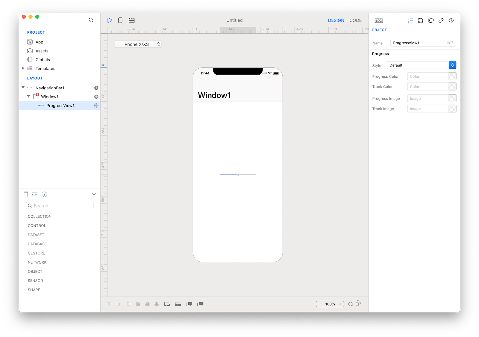
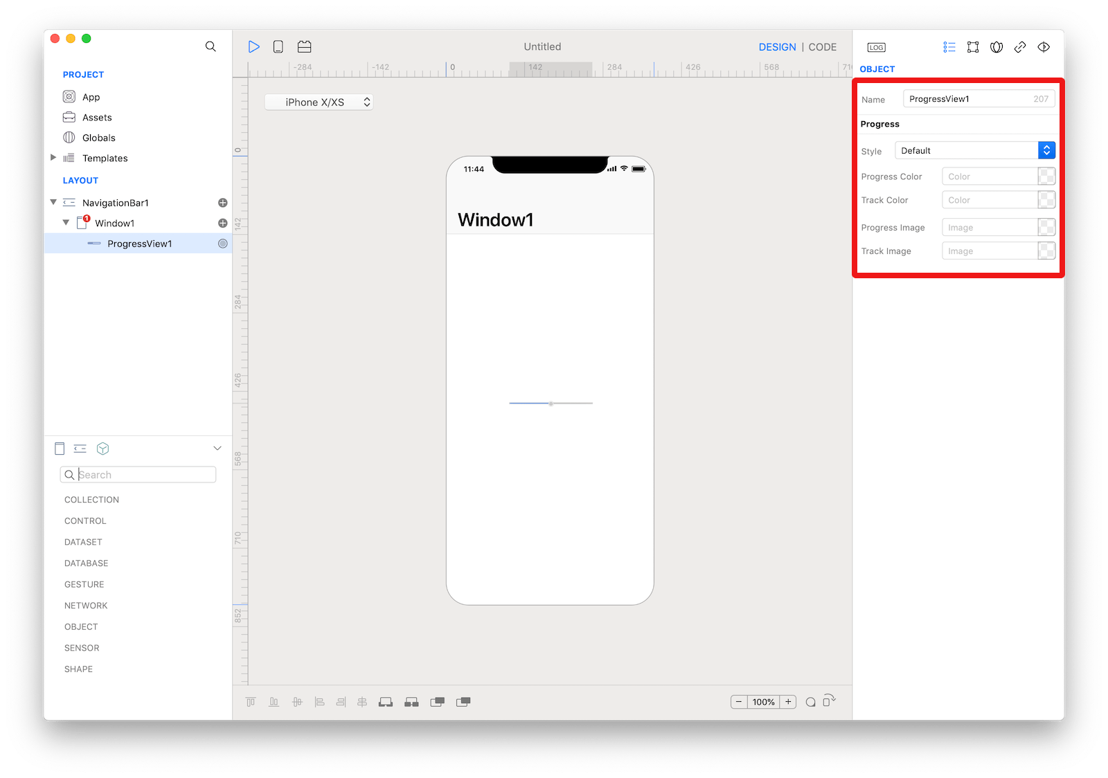 The inspector where the
 ProgressView class can be configured.
Example
- Drop a
Buttoncontrol from the object panel to aWindow - Open the
Code Editor - Select the
Actionitem inside theEventsarea and write your custom code in theCode EditorProgressView1.value = 1.0
Most important properties
Several UI aspects can be configured in the ProgressView class but the progressViewStyle, and value are the most commons to be configured.
progressViewStyle: The current graphical style of the receiver.value: The current progress shown by the receiver. The current progress is represented by a floating-point value between 0.0 and 1.0, inclusive, where 1.0 indicates the completion of the task. The default value is 0.0. Values less than 0.0 and greater than 1.0 are pinned to those limits.
References
ProgressView class reference contains a complete list of properties and methods that can be used to customize a ProgressView object.