TableView
A table presents data as a scrolling, single-column list of rows. Use a table to display large or small amounts of information cleanly and efficiently in the form of a list. Generally speaking, tables are ideal for text-based content.
How to use
- Drop a
TableViewcontrol from the object panel to aWindow - Use the
TableView Inspectorto customize its properties.
If you need to write code for TableView:
- Open the
Code Editor - Select the
DidSelectCellitem inside theEventsarea and write your custom code in theCode Editor
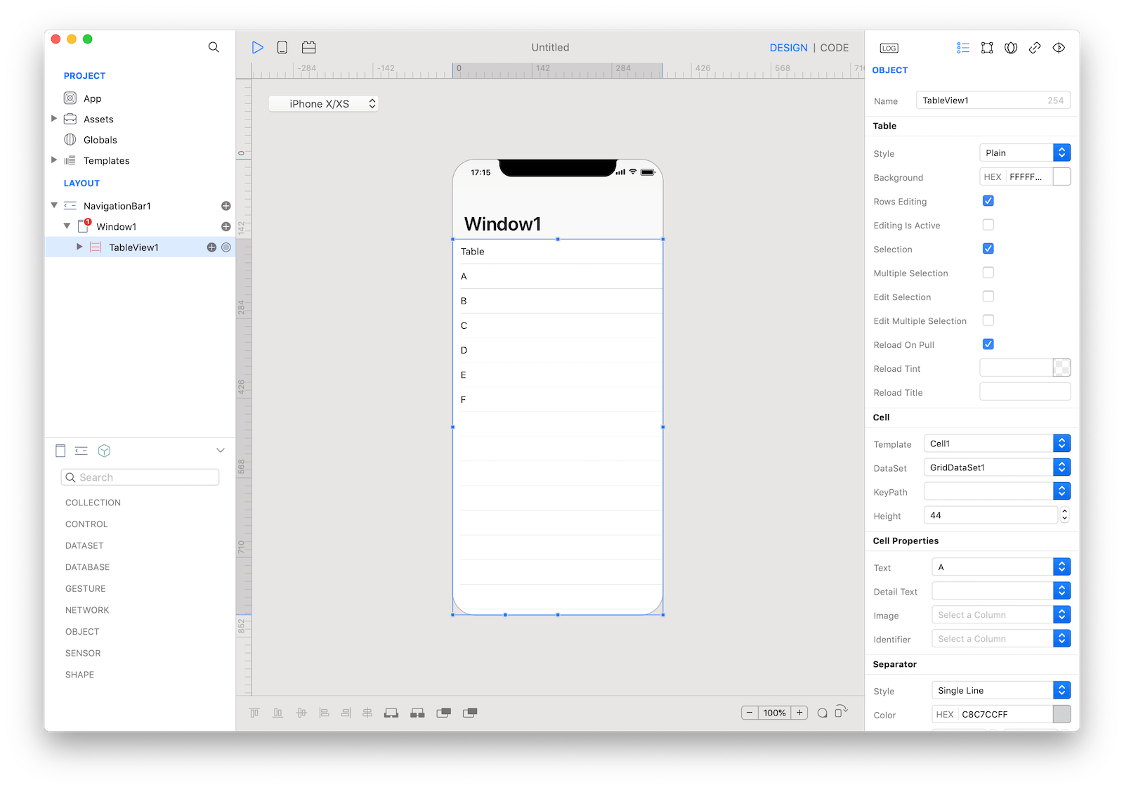
 The inspector where the
 TableView class can be configured.
Several UI aspects can be configured in the TableView class but Template, DataSet, and the Cell Properties (Text, Detail Text, Image) are the most commons to be configured.
Template: TheTableViewCellused as the template that will be duplicated to create every single row of theTableView.DataSet: The source of the data presented by theTableView. It must be an object that implements the DataSet specs, for example Assets, Databases, HTTPClient (REST), BTCentral, Location, Motion and many others.KeyPath: TheTableViewcan present only lists of data, so theDataSetmust return an object of type List or aRecordSet. If theDataSetis representing complex hierarchical data (see thetreeDataproperty of theDataSetclass), for example a JSON object returned by anHTTPRequest, theKeyPathproperty defines the base keypath used to extract aListobject from theself.valueproperty of theDataSet.Text,Detail Text,Imageand custom properties exposed by the configuredCustomView(if any): The database column or the keypath, depending on the type of theDataSet, used to retrieve the data for each property of the cell from the value of theDataSetat a specific index.
Customization
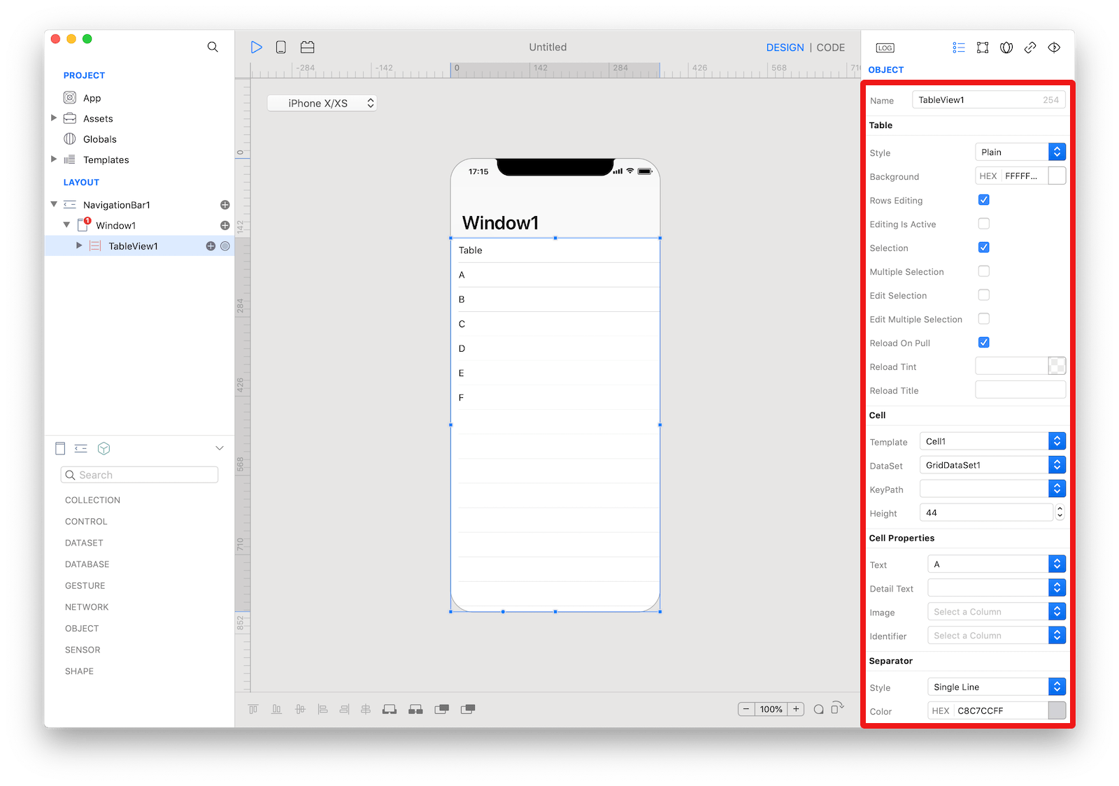
The appearance of the content of a TableView can be customized by tapping the subnode icon (+).
 Available subnodes in a
 TableView.
The available types of subnodes are:
- Header: An accessory
CustomViewthat is displayed above the table. - Footer: An accessory
CustomViewthat is displayed below the table. - Cell: The template used to create one
TableViewCellinstance for each row (the number of rows and the data for each row is provided by theDataSet). You can add more than one Cell subnodes, but only the Cell set in theTemplateproperty of theTableViewis used.
TableViewCell
A TableViewCell defines the attributes and behavior of the cells that appear in a TableView. Use the TableViewCell inspector to customize its properties like
Style: choose between four built-in styles:- Basic: An optional image on the left side of the row, followed by a left-aligned title. It’s a good option for displaying items that don’t require supplementary information.
- Subtitle: A left-aligned title on one line and a left-aligned subtitle on the next. This style works well in a table where rows are visually similar. The additional subtitle helps distinguish rows from one another.
- Right Detail: A left-aligned title with a right-aligned subtitle on the same line.
- Left Detail: A right-aligned title, followed by a left-aligned subtitle on the same line.
- None: Don't use any built-in field, the content must be presented by a
CustomViewsubnode.
Background: Background color of the cells.Alternate: Background color of the cells at odd indexes. If not set, theBackgroundis used.Custom View(optional): ACustomViewadded to theTableViewCell. TheCustomViewis resized with the size of theTableViewCell. You can use a globalCustomViewfrom theTemplatesfolder or theCustomViewsubnode of theTableViewCell. The exposed properties of theCustomVieware presented in the Cell CustomView Properties section of theTableView's inspector, use the inspectors to configure theDataSet's column/keypath for each property.
 A
A TableViewCell.
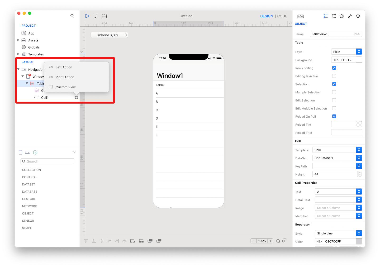
The content of a TableViewCell can be customized by tapping the subnode icon (+).
The available subnode types are:
Left Action: Add aTableViewRowActionobject. When the user swipes horizontally to the right in a row, the table view moves the row content aside to reveal your left actions. Tapping one of the action buttons executes the action of theTableViewRowAction.Right Action: Add aTableViewRowActionobject. When the user swipes horizontally to the left in a row, the table view moves the row content aside to reveal your right actions. Tapping one of the action buttons executes the action of theTableViewRowAction. _Custom View: Add aCustomViewthat can be used for theCustom Viewproperty of theTableViewCell.
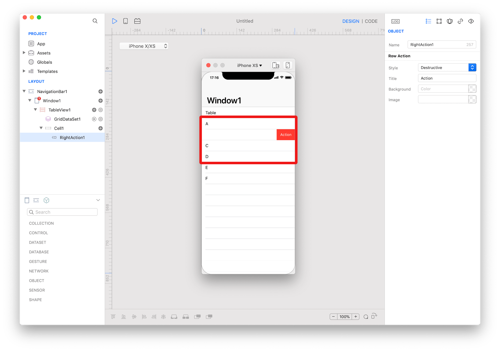 An example of a
 TableViewCell with two right TableViewRowAction.
Example
- Drop a
TableViewcontrol from the object panel to aWindow - Drop some images from the system Finder to the
Assetsfolder. - Set the Assets value in the
DataSetproperty from the inspector of the TableView1. - Set the Name value in the
Textproperty from the inspector of the TableView1. - Open the
Code Editor - Select the
DidSelectCellitem inside theEventsarea and write your custom code in theCode EditorConsole.write("Selected Cell \(cell.text) at index \(index)")
References
- TableView class reference contains a complete list of properties and methods that can be used to customize a
TableViewobject. - TableViewCell class reference contains a complete list of properties and methods that can be used to customize a
TableViewCellobject. - TableViewRowAction class reference contains a complete list of properties and methods that can be used to customize a
TableViewRowActionobject. - ToDo tutorial contains an example on how to configure a
TableViewobject and how to open a detailWindowfor the selected row. - Lets Cook Navigation tutorial contains an example on how to configure a
TableViewobject and how to open a detailWindowfor the selected row. - Expose events from a CustomView techNote