PageSplit
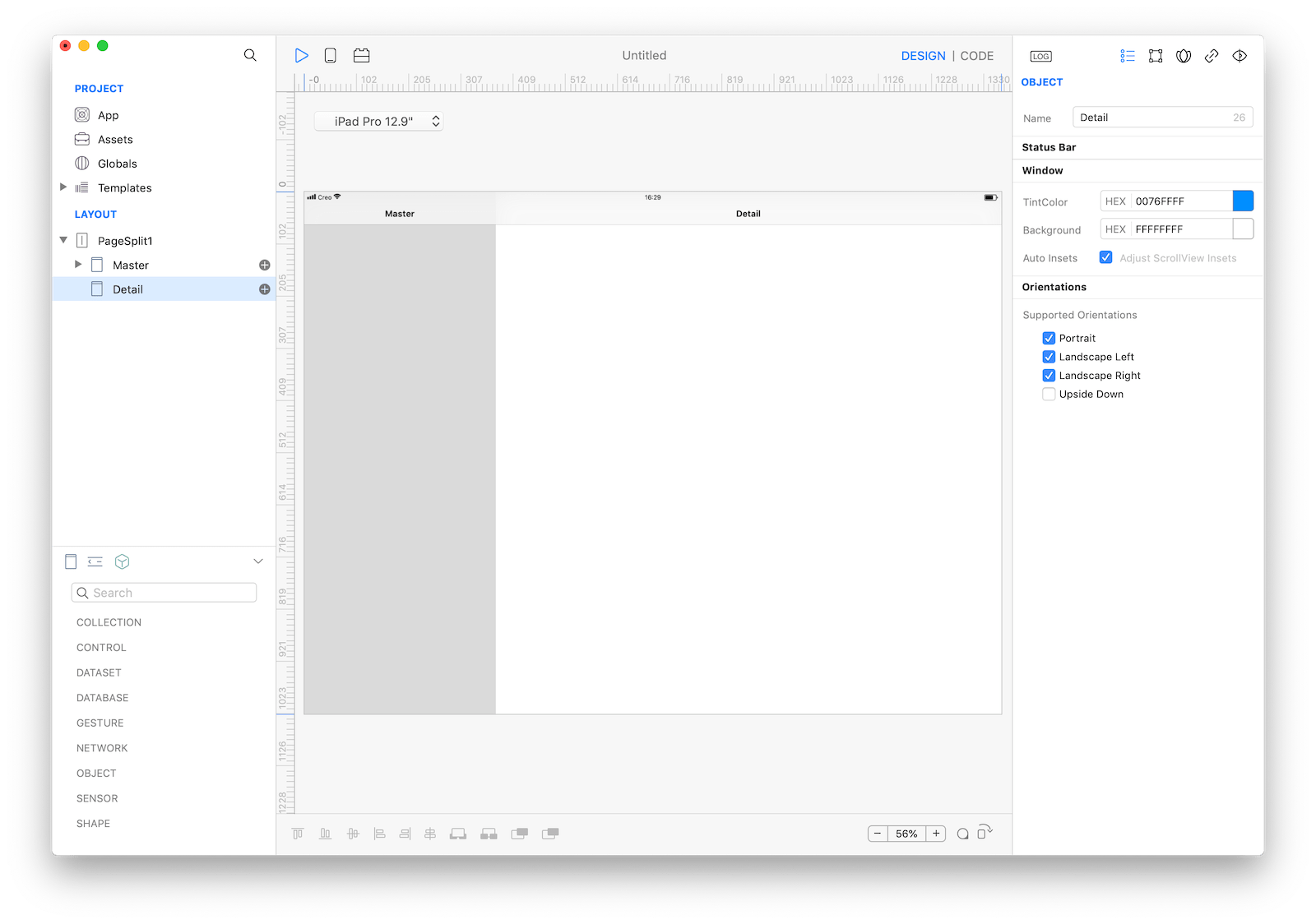
A PageSplit manages the presentation of two side-by-side panes of content, with persistent content in the primary pane and related information in the secondary pane. Each pane can contain any variety of elements, including navigation bars, toolbars, tab bars, tables, collections, images, maps, and custom views.
Best practices
Split views are often used with filterable content; a list of filter categories appears in the primary pane, and the filtered results for the selected category are shown in the secondary pane. If your app requires it, the primary pane can overlay the secondary pane and can be hidden offscreen when not in use. This is particularly useful when the device is in portrait orientation, as it allows more room for viewing content in the secondary pane.
Note: when building your app’s user interface, the split view controller is typically the root screen of your app’s window.
- Choose a split-view layout that works well with your content. By default, a split view devotes a third of the screen to the primary pane and two-thirds to the secondary pane.
- Persistently highlight the active selection in the primary pane. Although the secondary pane’s content can change, it should always correspond to a clearly identifiable selection in the primary pane.
- In general, restrict navigation to one side of a split view. Placing navigation in both panes of a split view makes it hard for people to stay oriented and discern the relationship between the two panes.
- Provide multiple ways to access a hidden primary pane. On layouts where the primary pane may be offscreen, be sure to provide a button—typically in a navigation bar—to reveal the pane.
How to use
There are 2 ways to use PageSplit:
-
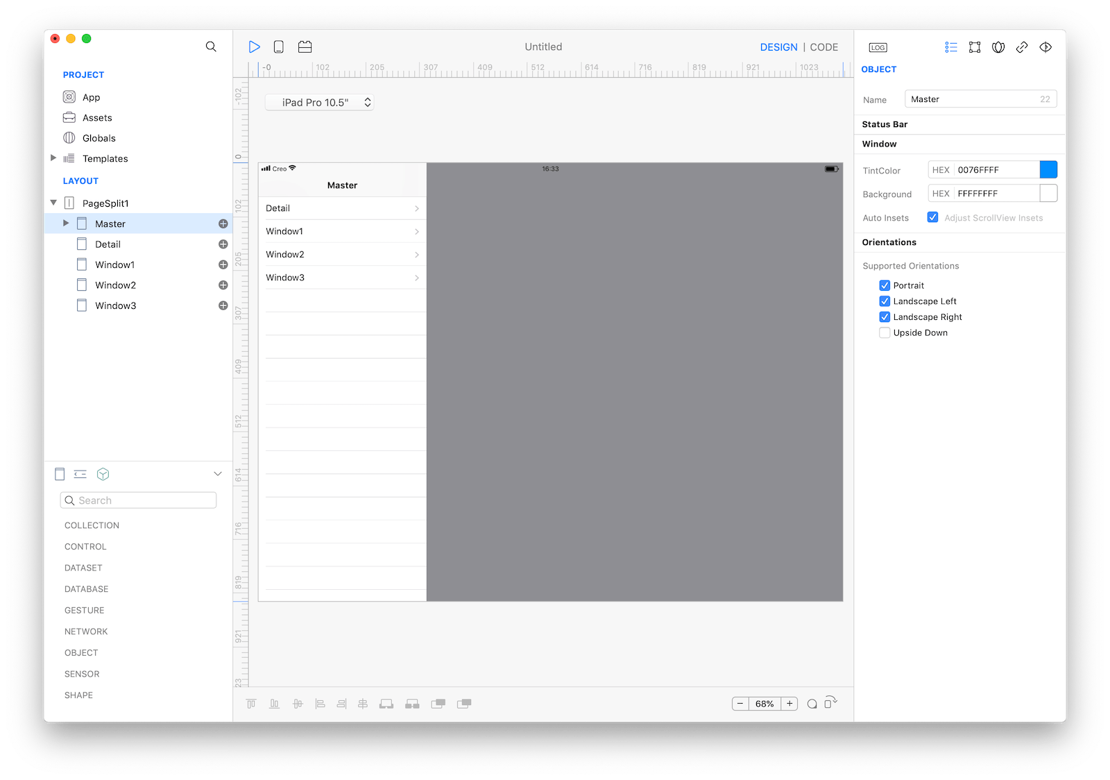
using the default template by dropping
PageSplitas the layout root screen and using the providedMasterTable. The table populates the master pane with all childrenWindowand you just need to tap the cells to open the selected window on the detail pane. -
Dropping
PageSplitas the layout root screen and replacing the wholeMasterTablewith any custom control or by just replacing its dataset.
Default PageSplit
- Drop
PageSplitas the root screen - Use the
PageSplit Inspectorto customize its appearance andDisplay Mode - Drop one or more
WindowasPageSplitchild screens; each of them will be presented in the master pane table - Configure MasterTable and Cell to reflect your UI.
- tap Play and test many simulators to understand how
Display Modeinfluences the layout with different device's family and orientations.
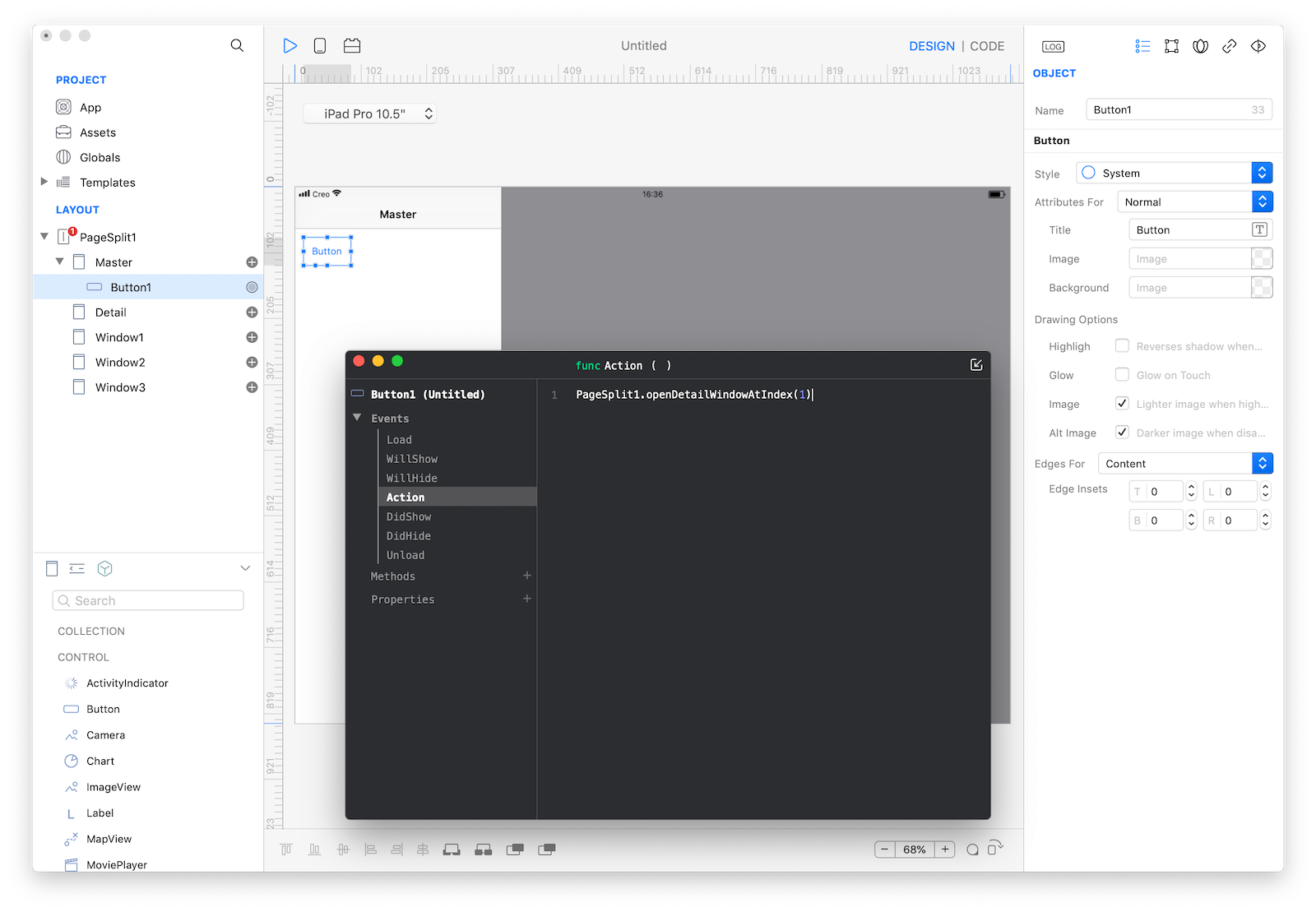
Note: the default PageSplit template works using 2 Creo concepts, datasets and events:
- the table is configured to use
PageSplitas a dataset - the table event
DidSelectCellopens the proper detail pane by calling:PageSplit1.openDetailWindowAtIndex(index)where index zero is the first
WindowbelowMaster(in the default template is called Detail)
PageSplit with custom master/detail logic
- Drop
PageSplitas the root screen - Use the
PageSplit Inspectorto customize its appearance andDisplay Mode - Replace MasterTable with any other control or select a different dataset.
- Drop one or more
WindowasPageSplitchild screens - Anytime you need to present a proper detail pane call
PageSplit1.openDetailWindowAtIndex(index)where index zero is the firstWindowbelowMaster. - tap Play and test many simulators to understand how
Display Modeinfluences the layout with different device's family and orientations.
Most important properties
Several UI aspects can be configured in the PageSplit class but the Display Mode and Bar Color are the most popular to be configured.
Display Mode: The visual configuration of aPageSplit, its behavior changes with each device orientation and family (ie iPad and iPhone).Bar Color: The bar tint color
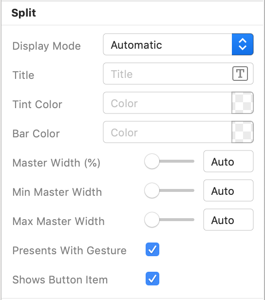 The inspector where the
 PageSplit class can be configured.
References
PageSplit class reference contains a complete list of properties and methods that can be used to customize a PageSplit object.