TabBar
A tab bar appears at the bottom of an app screen and provides the ability to quickly switch between different sections of an app. Tab bars are translucent, may have a background tint, maintain the same height in all screen orientations, and are hidden when a keyboard is displayed. A tab bar may contain any number of tabs, but the number of visible tabs varies based on the device size and orientation. If some tabs can’t be displayed due to limited horizontal space, the final visible tab becomes a More tab, which reveals the additional tabs in a list on a separate screen.
Best practices
When an application has multiple sections then TabBar is usually the start-up window and is used to organize information at the app level, ie:
- the sections of a social app: 1 screen for the feeds, 1 screen for the user profile, 1 for creating new posts and so on
- the sections of a navigator app: 1 screen for driving information, 1 screen to explore your surrounding and 1 for the public transport
How to use
- Drop a
TabBaras a root screen and customize the appearance, ie translucent, tint and so on - Drop 1 or more child
WindoworNavigation - For each child customize its
TABBAR Itemby tapping the (+) icon
Example
- Start dropping a
TabBarinto the LAYOUT by tapping the New Navigation button on the Objects Bar
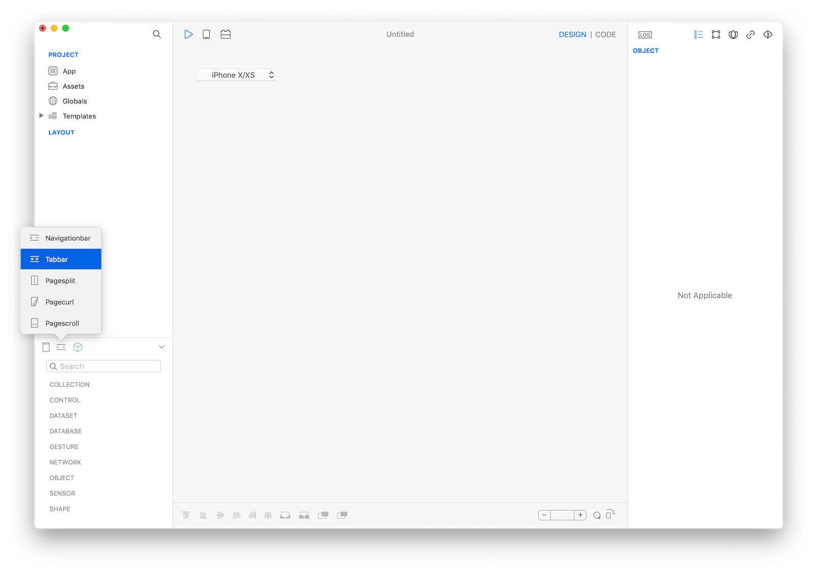
- Configure the
TabBarby addingWindoworNavigationchild screens - Configure each screen to add a
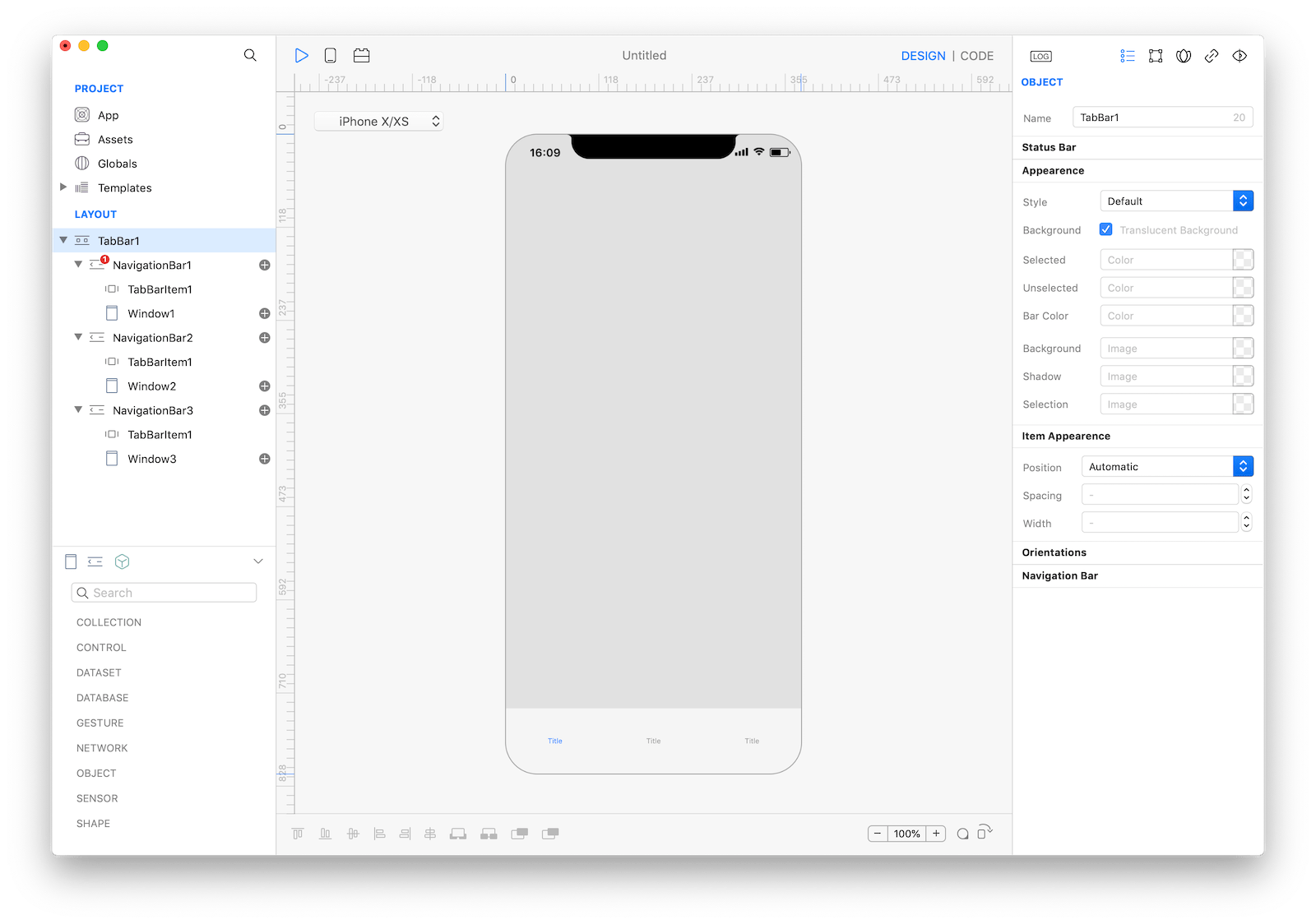
TABBAR Item - Keep doing the same until you have a hierarchy like this
- TabBar
- Navigation1 (startup window)
- TabBarItem1
- Window1
- Navigation2
- TabBarItem1
- Window2
- Navigation3
- TabBarItem1
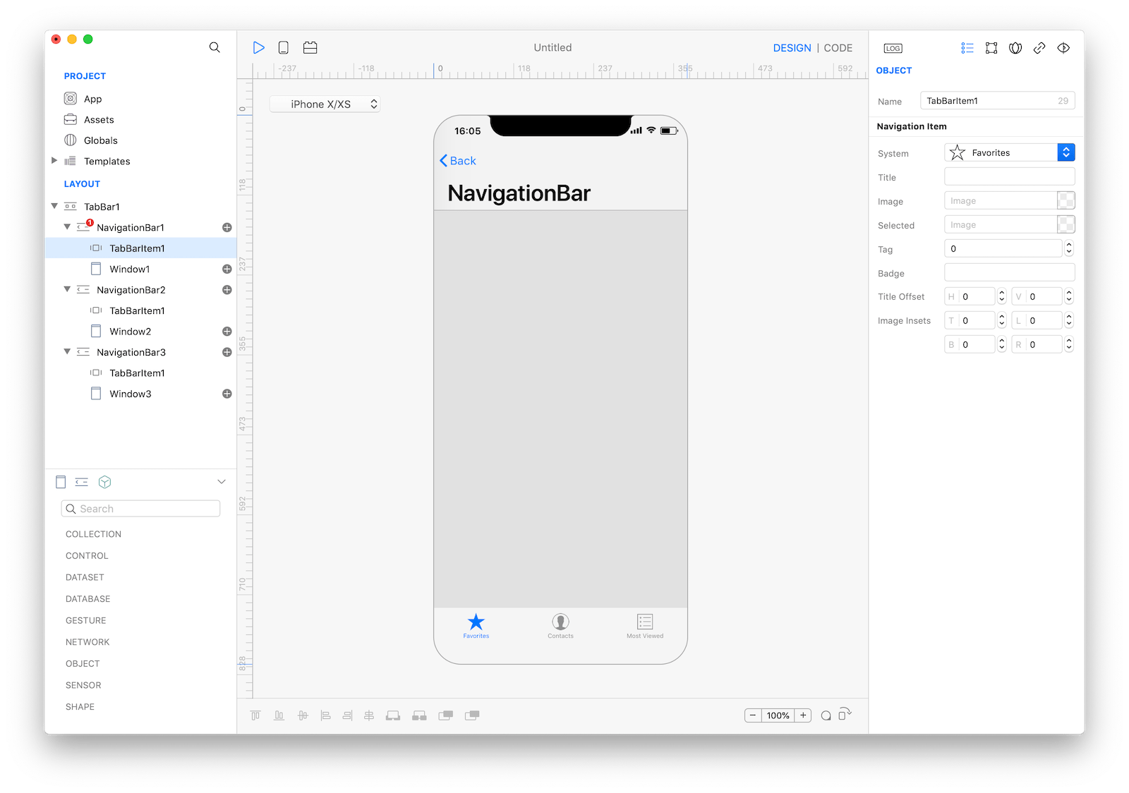
- Window3Note: it is common practice to drop Navigation as the child of a TabBar and configure the Navigation Bar setting Hide Navigation Bar to true.
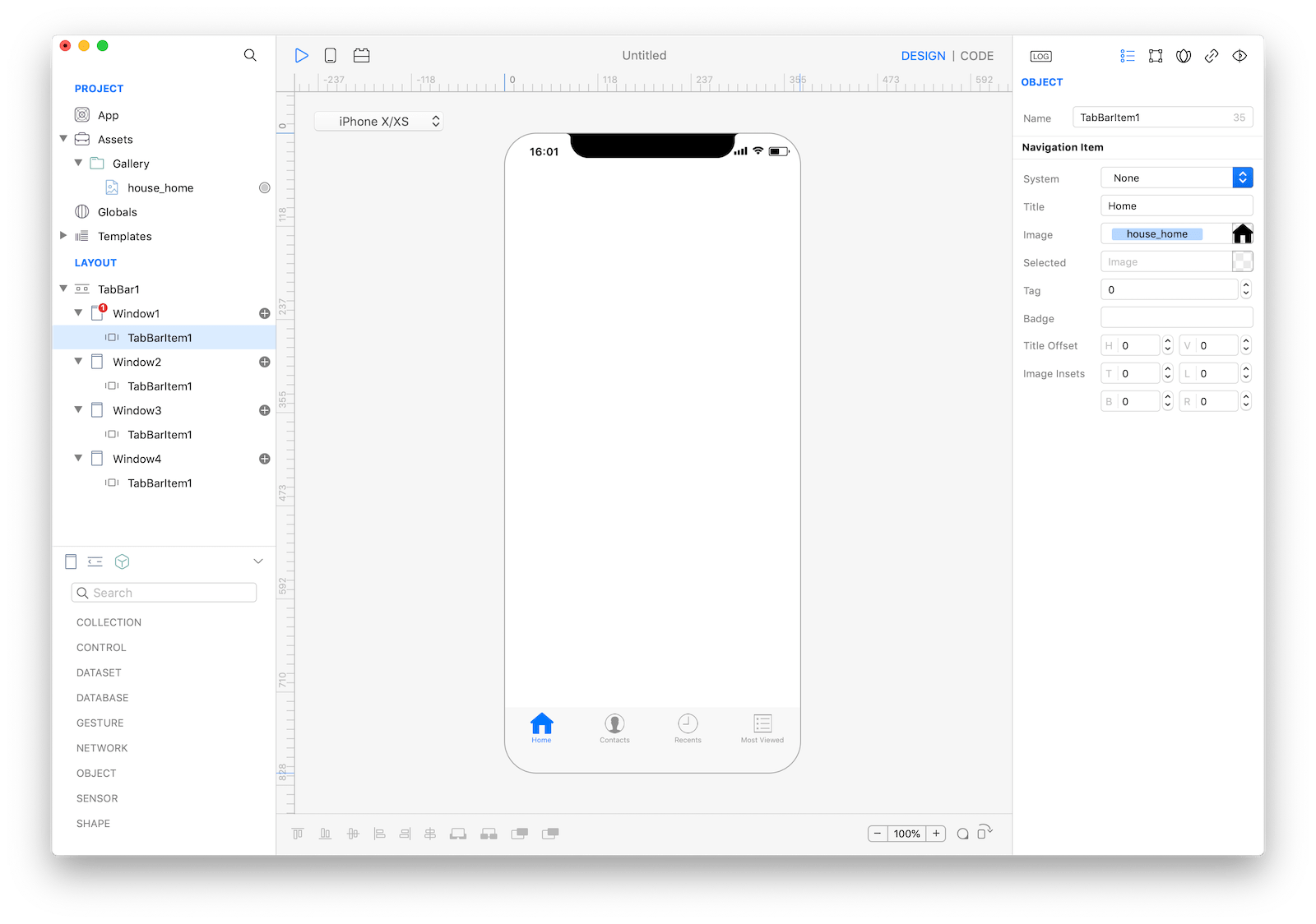
TABBAR Item
The TABBAR Item can be created by tapping the subnode icon (+)
The main settings include:
- A custom title
- A badge value
- An icon
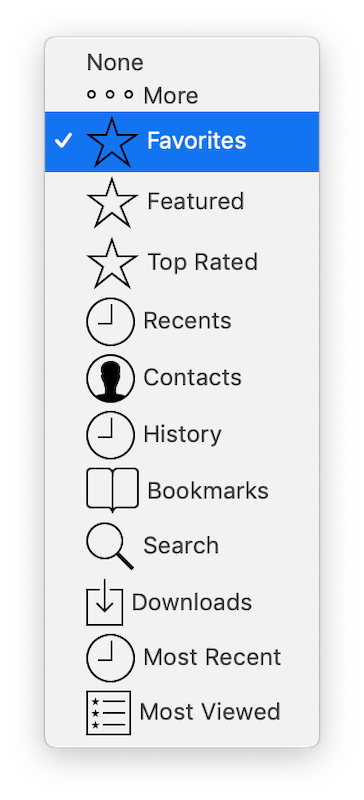
The icon can both be custom (with a user provided image) or selected from the list of system TabBar icons.
Note: without the TABBAR Item the title itself is automatically retrieved from the name of the current children Window.
Interacting using Gravity
TABBAR Item properties can be set by code, ie
Navigation1.TabbarItem1.badgeValue = "10"Most important properties
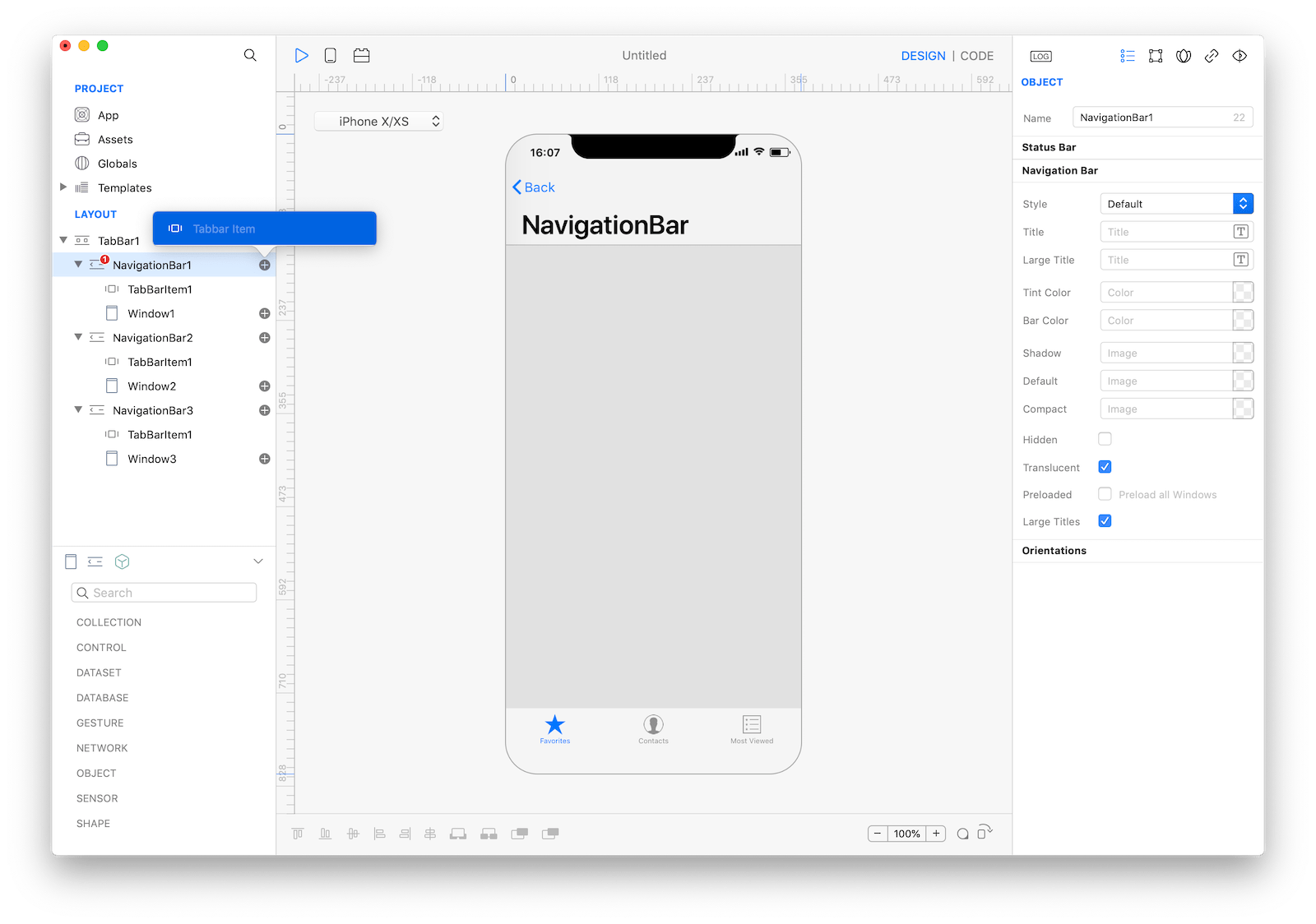
Several UI aspects can be configured but the most used are:
Style, white with dark text or black with light text.Translucent Background, when set true the tab bar adds a translucent effect to its background image or tint color.Bar Color, the tint color to apply to the bar.
References
TabBar contains a complete list of properties and methods that can be used to customize a TabBar object.