CollectionView
A collection manages an ordered set of content, such as a set of photos, and presents it in a customizable and highly visual layout. Because a collection doesn’t enforce a strictly linear format, it’s particularly well-suited to displaying items that vary in size. Generally speaking, collections are ideal for showing off image-based content. Backgrounds and other decorative views can optionally be implemented to visually distinguish subsets of items. Collections support both interactivity and animation. By default, you can tap to select, touch and hold to edit, and swipe to scroll. If your app requires it, more gestures can be added for performing custom actions. Within a collection, animations can be enabled whenever items are inserted, deleted, or reordered, and custom animations are also supported.
Best practices
- Avoid creating radical new designs when a standard row or grid layout is sufficient. A collection should enhance the user experience, not become the center of attention. Make it easy to select an item. If it’s hard to tap an item in your collection, people will get frustrated and lose interest before reaching the content they want. Use adequate padding around content to keep the layout clean and prevent overlapping of content.
- Consider using a table instead of a collection for text. It’s generally simpler and more efficient to view and digest textual information when it’s displayed in a scrollable list.
- Use caution when making dynamic layout changes. The layout of a collection can be changed at any time. If you dynamically change the layout while people are viewing and interacting with it, be sure the change makes sense and is easy to track. Unmotivated layout changes can make your app seem unpredictable and difficult to use. If context is lost due to a layout change, people are likely to feel like they’re no longer in control.
How to use
- Drop a
CollectionViewcontrol from the object panel to aWindow - Use the
CollectionView Inspectorto customize its properties likeLayout Type,Template,DataSet,KeyPath, andAllows Selection
If you need to write code for CollectionView:
- Open the
Code Editor - Select the
DidSelectCellitem inside theEventsarea and write your custom code in theCode Editor
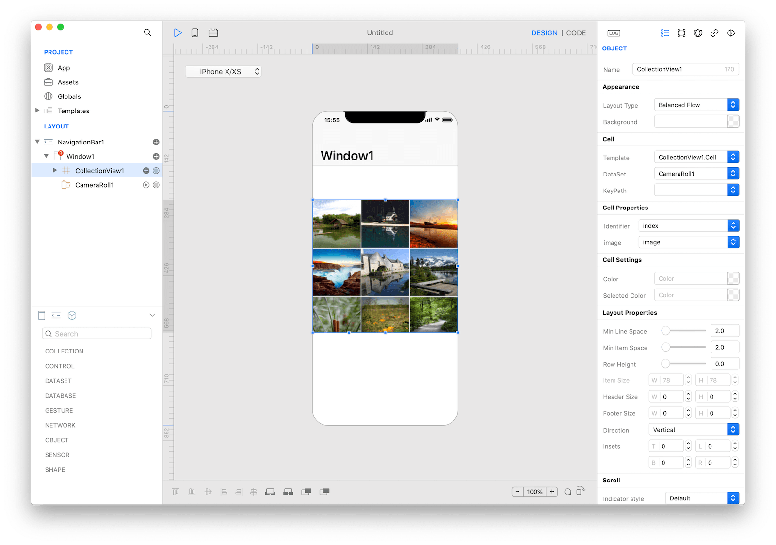
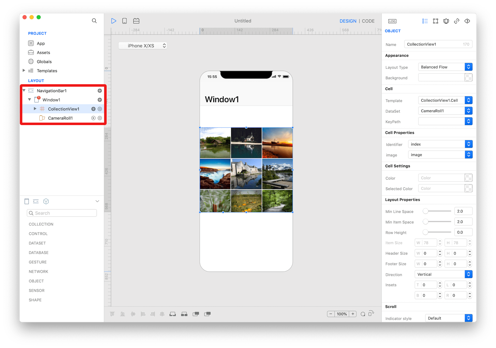
 The inspector where the
 CollectionView class can be configured.
How to customize
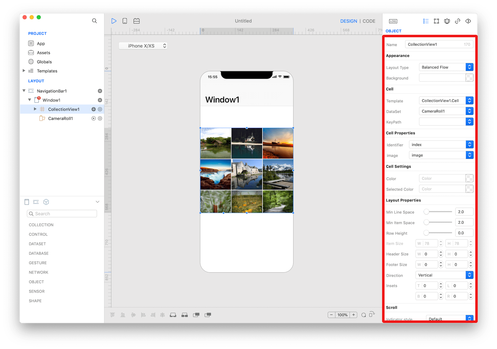
The CollectionView can be customized by tapping the subnode icons (+).
 The
The CollectionView customizations.
CollectionViewCell
A CollectionViewCell for placement on a CollectionView that can be configured by dropping a control like ImageView and Label.
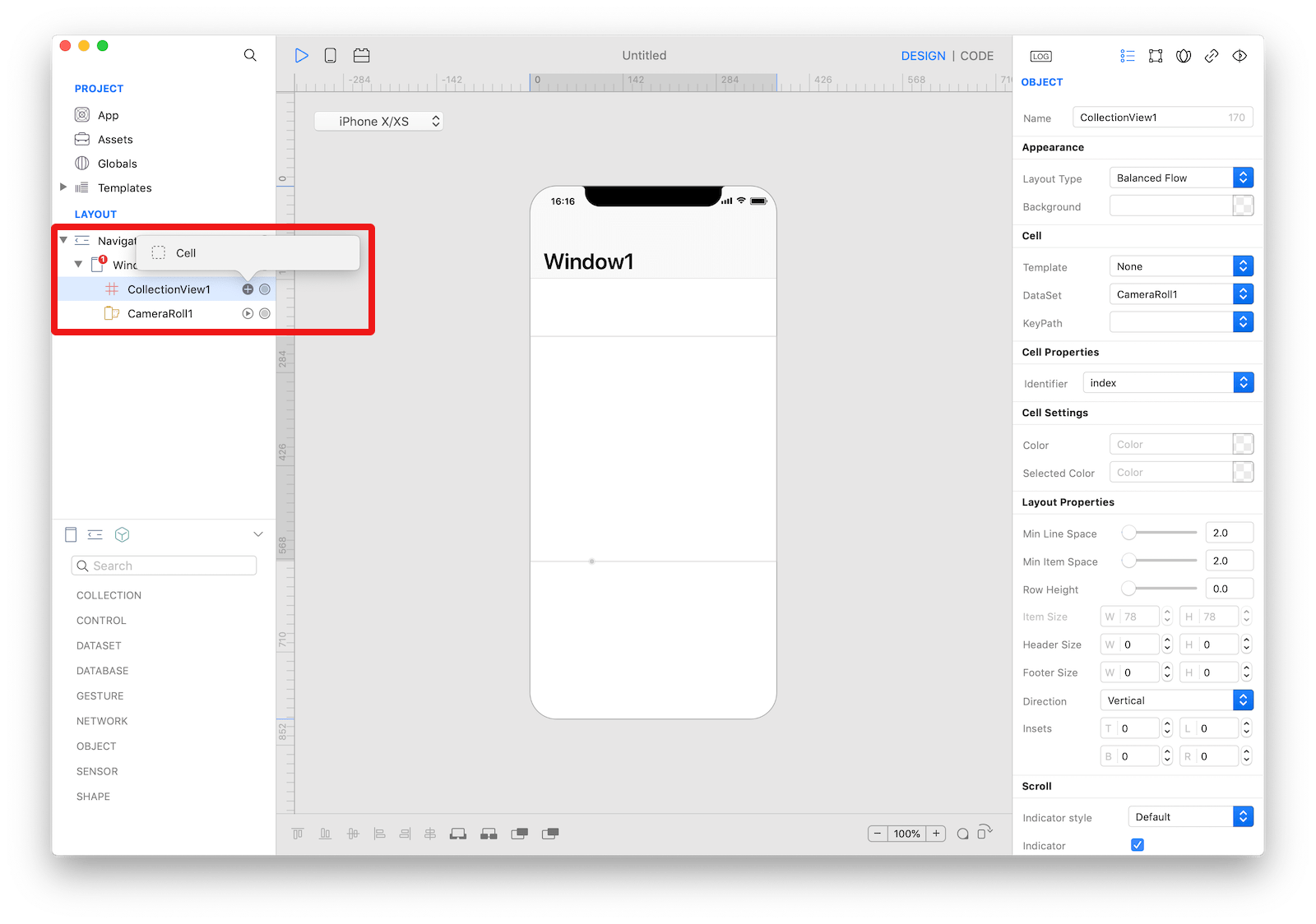
 The
The CollectionView cell.
How to use
- Select the
CollectionView Custom Cellfrom the layout panel - Drop a control from the object panel to the custom
Viewlike theImageViewandLabel
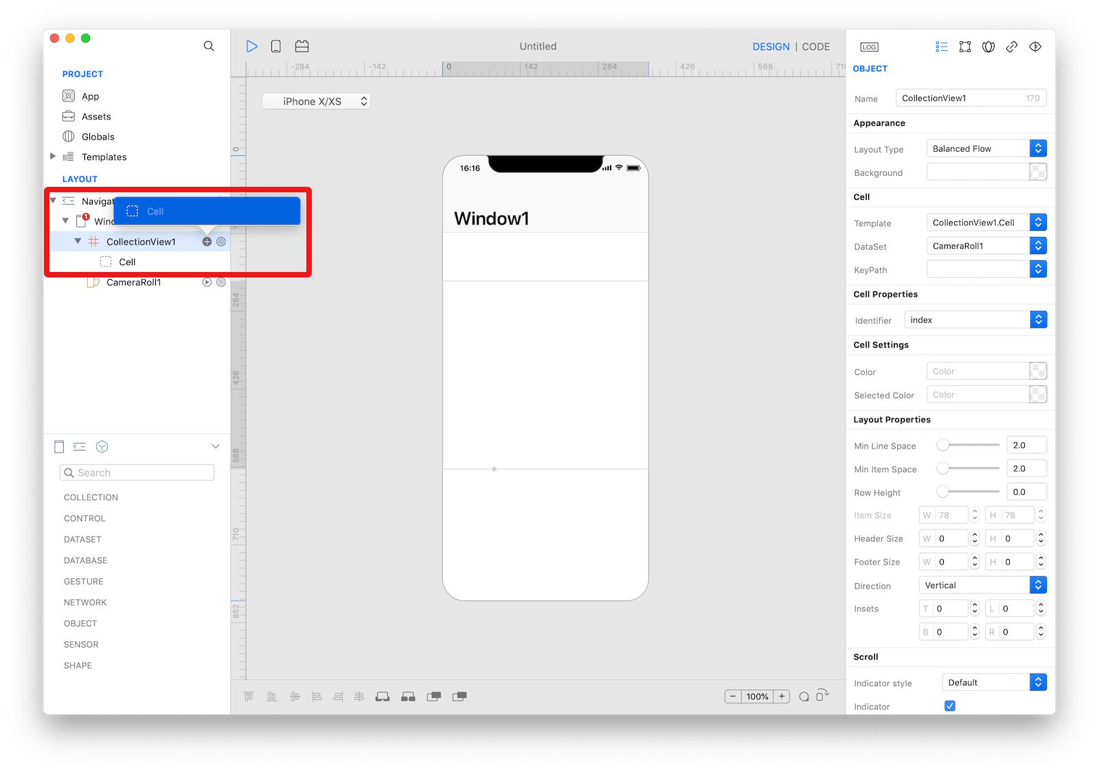
 The
The CollectionView cell.
Example
- Drop a
CameraRollcontrol from the object panel to aWindow - Drop a
Buttoncontrol from the object panel to aWindow - Open the
Code Editor - Select the
Actionitem inside theEventsarea and write your custom code in theCode EditorCollectionView1.dataSet = CameraRoll1 CollectionView1.reload(true)
Most important properties
Several UI aspects can be configured in the CollectionView class but the layoutType, itemSize, allowsSelection, dataSet, and keyPath are the most commons to be configured.
layoutType: The layout defines the organization and location of all cells and supplementary views inside the collection view. The layout type property allows you to choose between two mail styles (the simple flow and the balanced flow) while other layout properties (minimumLineSpacing, preferredRowSize, etc.) enable you to configure some details of the choosen layout style. With the simple flow the items in the collection view flow from one row or column (depending on the scrolling direction) to the next, with each row comprising as many cells as will fit. Cells can be the same sizes or different sizes (see the ItemSize event). With the balanced flow, the collection view displays items of different sizes in a grid without wasting any visual space.itemSize: The default size to use for cells. This results in cells that all have the same size. The default size value is (50.0, 50.0). Only applies to the simple flow layout type.allowsSelection: A Boolean value that indicates whether users can select items in the collection view. The default value is true.dataSet: The DataSet object provides information that CollectionView needs to construct its content. The dataSet must return a List of objects and each object represents a different row. If the DataSet value is not flat, for example a Map from a JSON result of an HTTPRequest, the keyPath property defines the list of keys used to browse the data tree to get a List node.keyPath: The base keyPath to get a particular node of the DataSet value. The DataSet must provide a List of objects and each object represents a different item. If the DataSet value is not flat, for example a Map from a JSON result of an HTTPRequest, the keyPath defines the list of keys used to browse the data tree to get a List node. The values for each exposed property of the cell are retrieved by adding the current index and the cell property key to the base keyPath.
References
CollectionView class reference contains a complete list of properties and methods that can be used to customize a CollectionView object.