Toolbar
A toolbar appears at the bottom of an app screen and contains buttons for performing actions relevant to the current view or content within it. Toolbars are translucent, may have a background tint, and often hide when people are unlikely to need them. For example, in Safari, the toolbar hides when you begin scrolling the page since you are likely reading. You can show it again by tapping the bottom of the screen. Toolbars are also hidden when a keyboard is onscreen.
Best practices
- Provide relevant toolbar buttons. A toolbar should contain frequently used commands that make sense in the current context.
- Consider whether icons or text-titled buttons are right for your app. Icons work well when you need more than three toolbar buttons. When you have three buttons or fewer, text can sometimes be clearer. In Calendar, for example, text is used because icons would be confusing. The use of text also allows the Inbox button to show a count of calendar and event invitations.
- Avoid using a segmented control in a toolbar. Segmented controls let people switch contexts, whereas a toolbar is specific to the current screen. If you need to provide a way to switch contexts, consider using a tab bar instead
- Give text-titled buttons enough room. If your toolbar includes multiple buttons, the text of those buttons may appear to run together, making the buttons indistinguishable. Add separation by inserting fixed space between the buttons.
How to use
- Drop a
Toolbarcontrol from the object panel to aWindow - Use the
Toolbar Inspectorto customize its properties likeStyleandBar Color
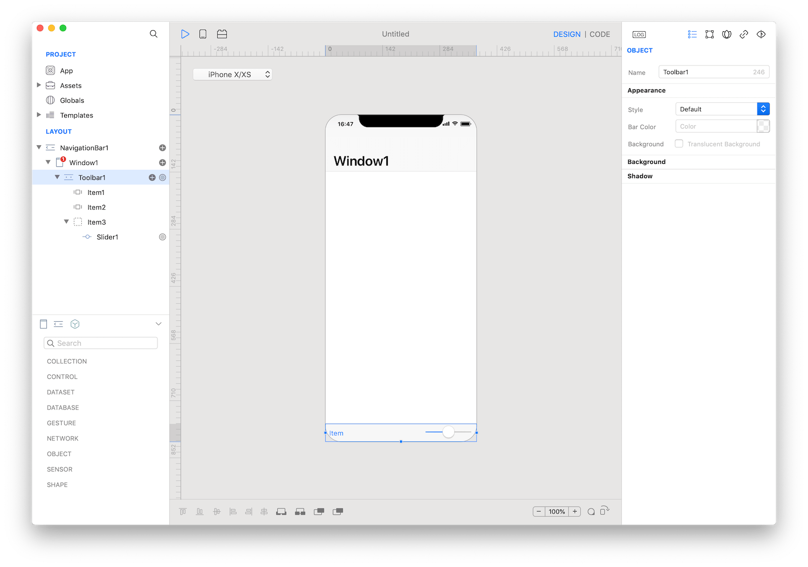
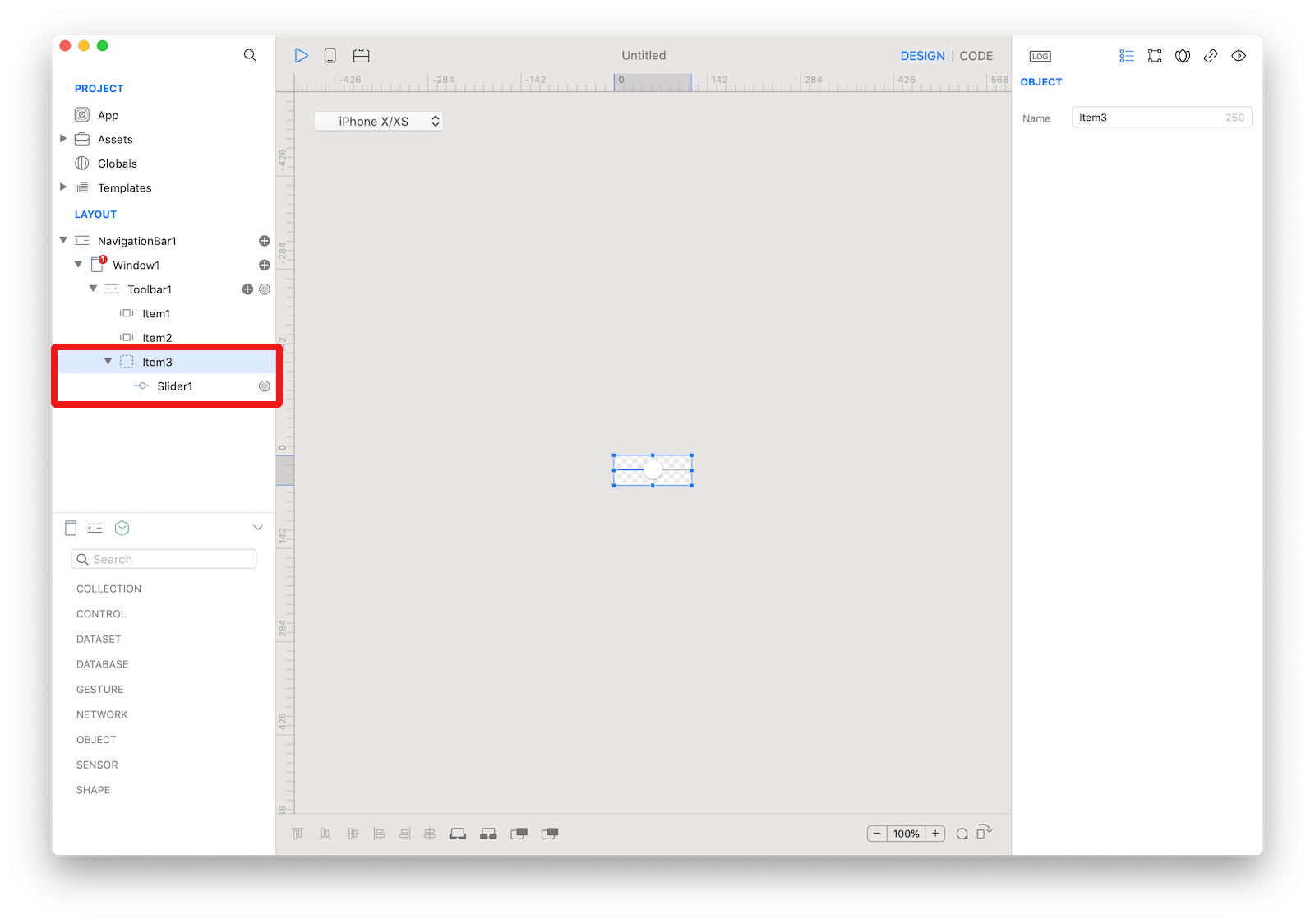
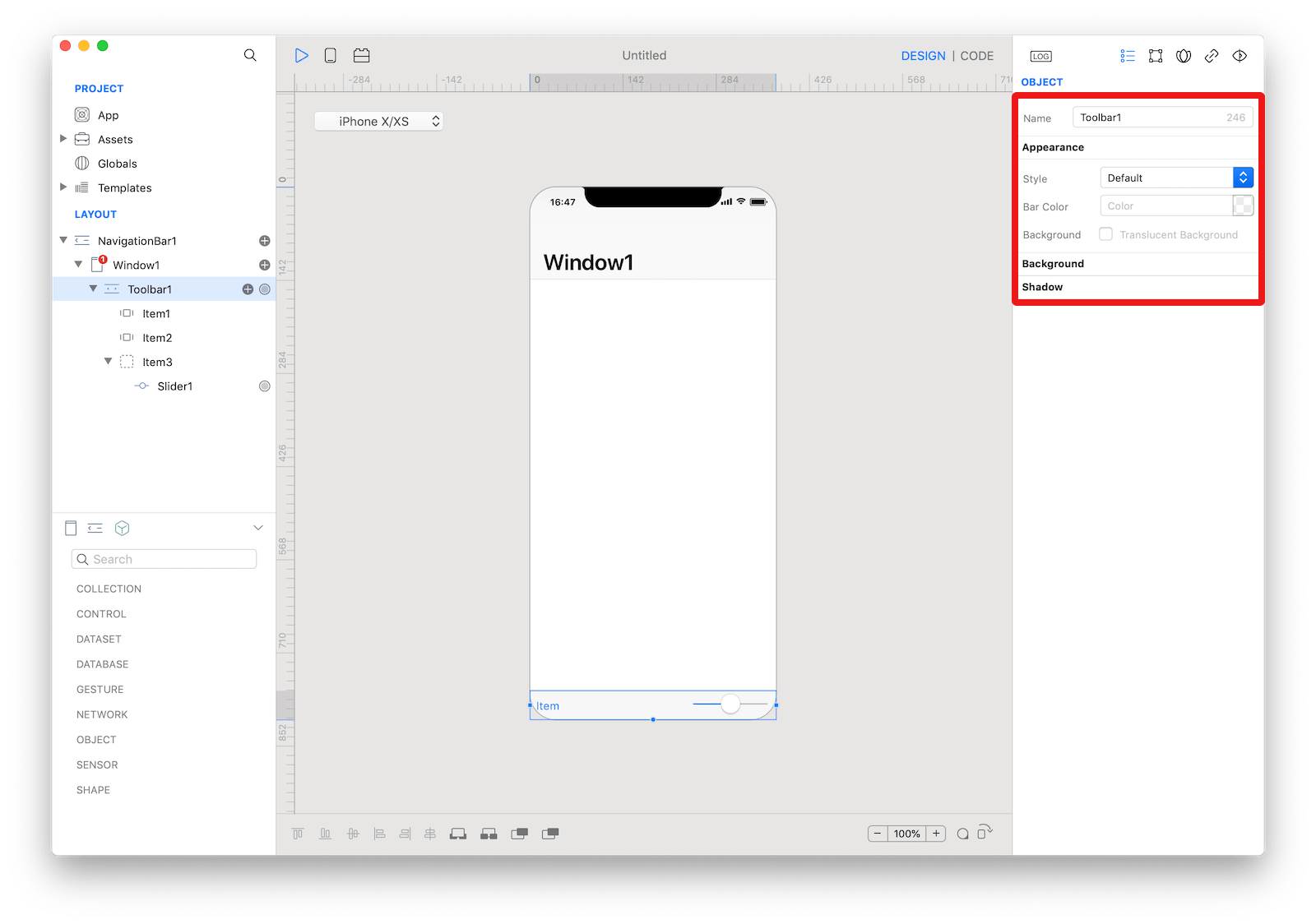 The inspector where the
 Toolbar class can be configured.
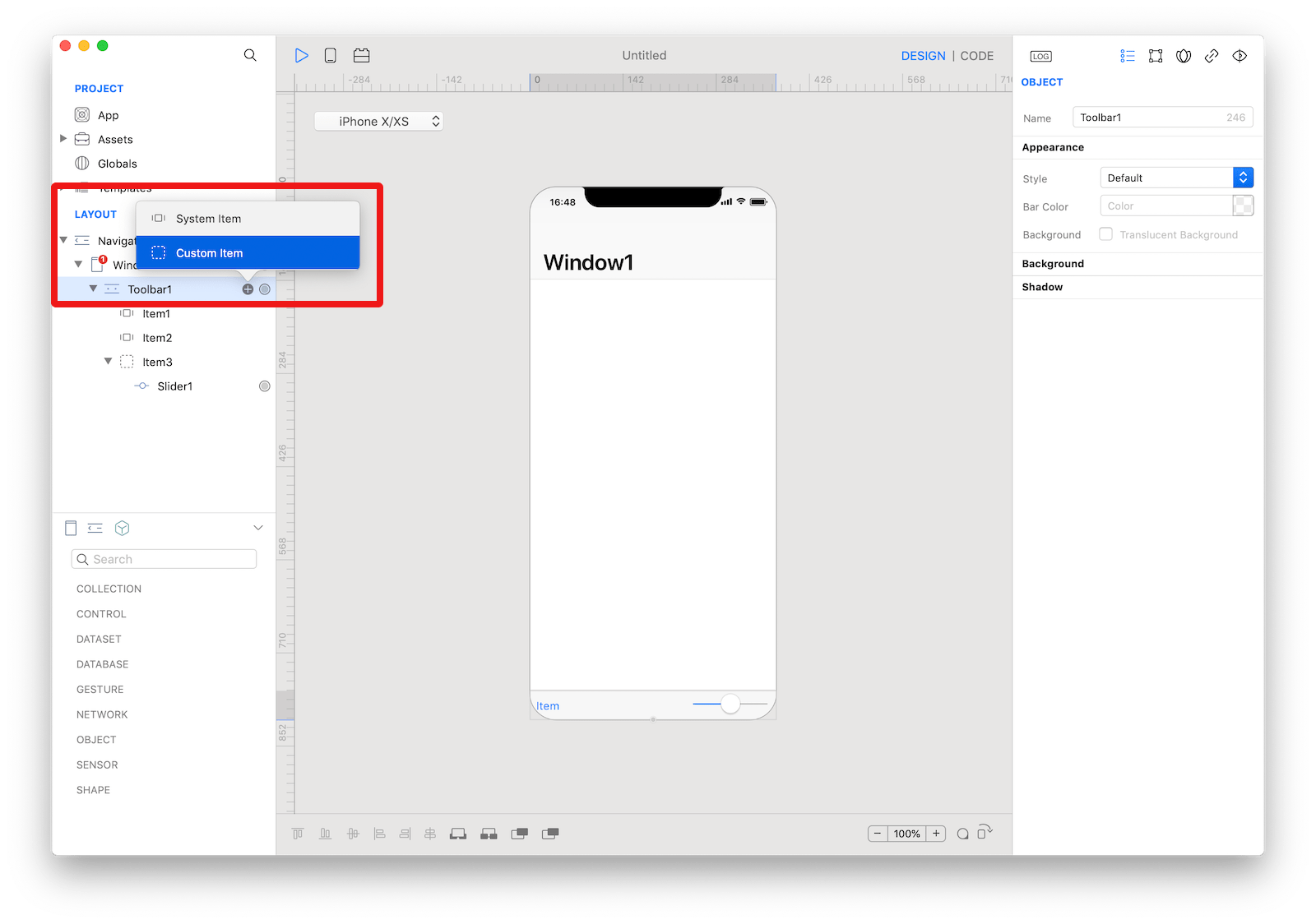
How to customize
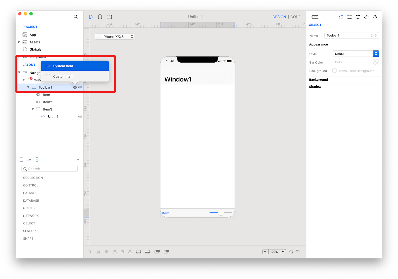
The Toolbar can be customized by tapping the subnode icons (+).
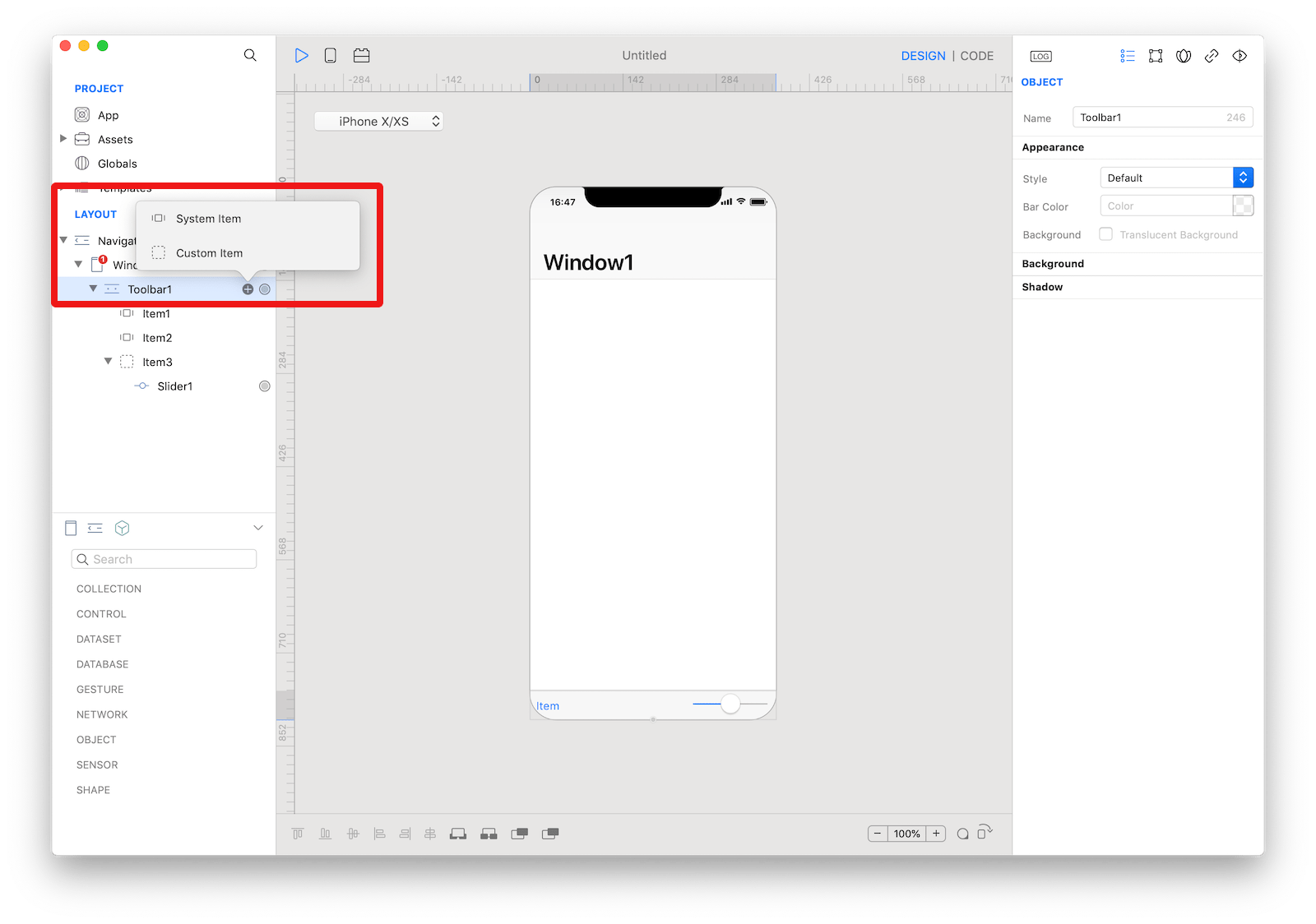 The
The Toolbar customizations.
System Item
A standard item for placement on a Toolbar that can be configured with a system style.
 The
The Toolbar system item.
How to use
- Use the
Toolbar System Item Inspectorto customize its properties likeSystem Item,TitleandImage.
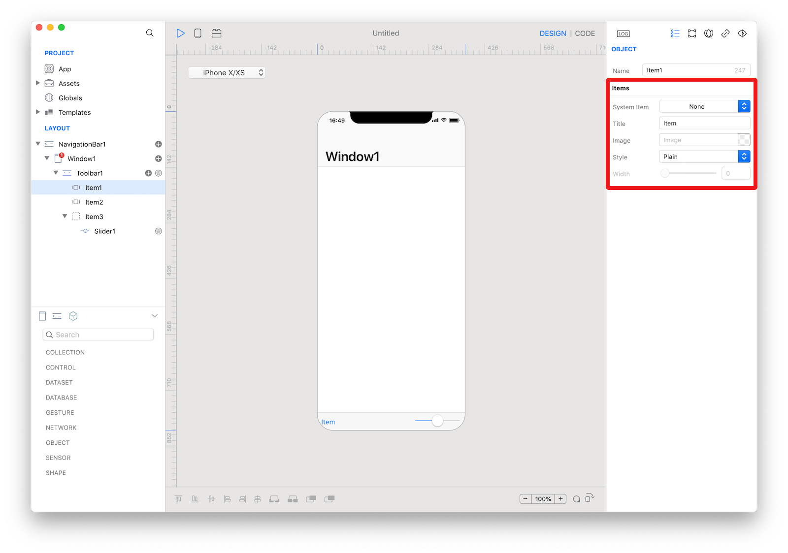 The
The Toolbar item customizations.
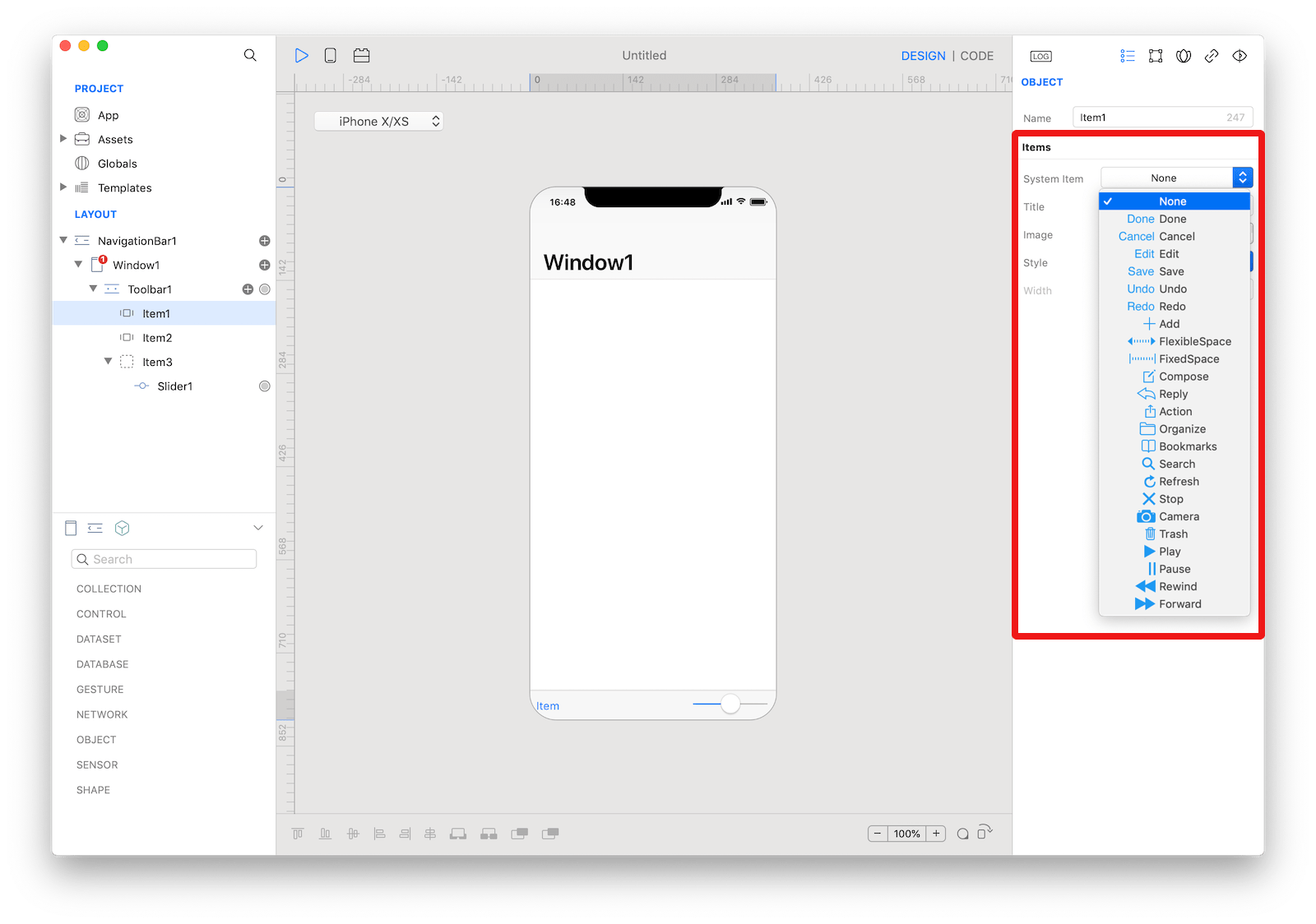 The
The Toolbar item system styles.
Custom Item
A custom item for placement on a Toolbar that can be configured for different purposes exposing and configuring a custom View.
 The
The Toolbar custom item.
How to use
- Select the
Toolbar Custom Itemitem from the layout panel - Drop a control from the object panel to the custom
View
 The
The Toolbar Custom Item item custom view.
Example
- Open the
Code Editor - Select the
Toolbaritem namedItem1 - Select the
Actionitem inside theEventsarea and write your custom code in theCode EditorConsole.write("Toolbar item title: \(self.title)") - Select the
Toolbaritem namedItem2 - Select the
Actionitem inside theEventsarea and write your custom code in theCode EditorConsole.write("Toolbar item title: \(self.title)")
Most important properties
Several UI aspects can be configured in the Toolbar class but the barStyle, barTintColor, and items are the most commons to be configured.
barStyle: The toolbar style that specifies its appearance.barTintColor: The tint color to apply to the toolbar background. This color is made translucent by default unless you set the translucent property to false.items: The items displayed on the toolbar.
References
Toolbar class reference contains a complete list of properties and methods that can be used to customize a Toolbar object.