ImageView
An image view displays a single image or an animated sequence of images over a transparent or opaque background. Within an image view, images may be stretched, scaled, sized to fit, or pinned to a specific location. Image views are non-interactive by default.
Best practices
- If possible, make sure all images in an animated sequence are consistently sized. Ideally, images should be rescaled to fit the view so the system doesn't have to do any scaling. If the system must perform scaling, it's easiest to achieve the desired results when all images are the same size and shape.
How to use
- Drop an
ImageViewcontrol from the object panel to aWindow - Use the
ImageView Inspectorto customize its properties likeImage,Highlight, andMode
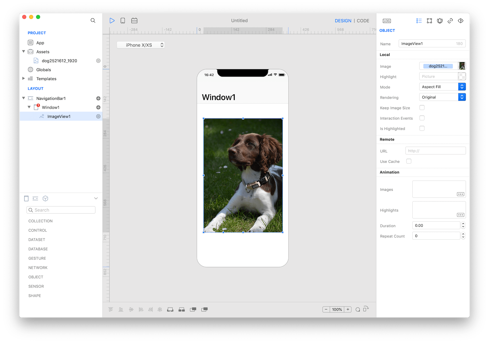
 The inspector where the
 ImageView class can be configured.
Example
- Drop a desired image to the
Assetsarea and name it asImage1 - Drop a
Buttoncontrol from the object panel to aWindow - Open the
Code Editor - Select the
Actionitem inside theEventsarea and write your custom code in theCode EditorImageView1.image = Image("Image1")
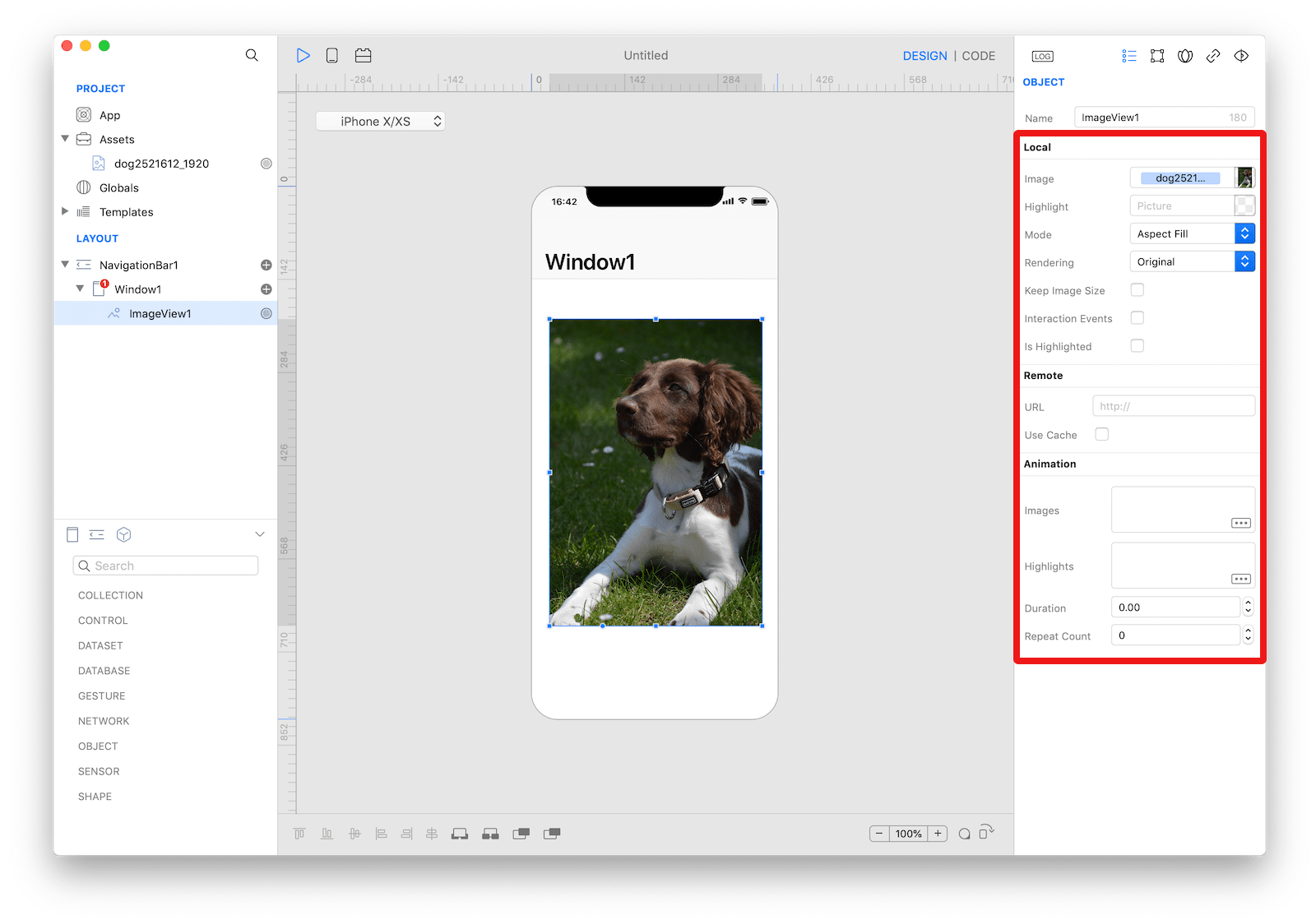
Most important properties
Several UI aspects can be configured in the ImageView class but the image, highlightedImage, and contentMode are the most commons to be configured.
image: The image displayed in the image view.highlightedImage: The highlighted image displayed in the image view.contentMode: Options to specify how a view adjusts its content when its size changes.
References
ImageView class reference contains a complete list of properties and methods that can be used to customize a ImageView object.