Stepper
A stepper is a two-segment control used to increase or decrease an incremental value. By default, one segment of a stepper displays a plus symbol and the other displays a minus symbol. These symbols can be replaced with custom images, if desired.
Best practices
- Make the value affected by the stepper obvious. A stepper itself doesn’t display any values, so make sure people know which value they’re changing when they use a stepper.
- Don’t use a stepper when large value changes are likely. Steppers work well for making small changes that require a few taps. On a printing screen, for example, it makes sense to use a stepper to set the number of copies because people rarely change this setting by much. On the other hand, it doesn’t make sense to use a stepper to choose a page range because even a reasonable page range would require lots of taps.
How to use
- Drop a
Steppercontrol from the object panel to aWindow - Use the
Stepper Inspectorto customize its properties likeValue,Min Value,Max ValueandIncrement
If you need to write code for Stepper:
- Open the
Code Editor - Select the
Actionitem inside theEventsarea and write your custom code in theCode Editor
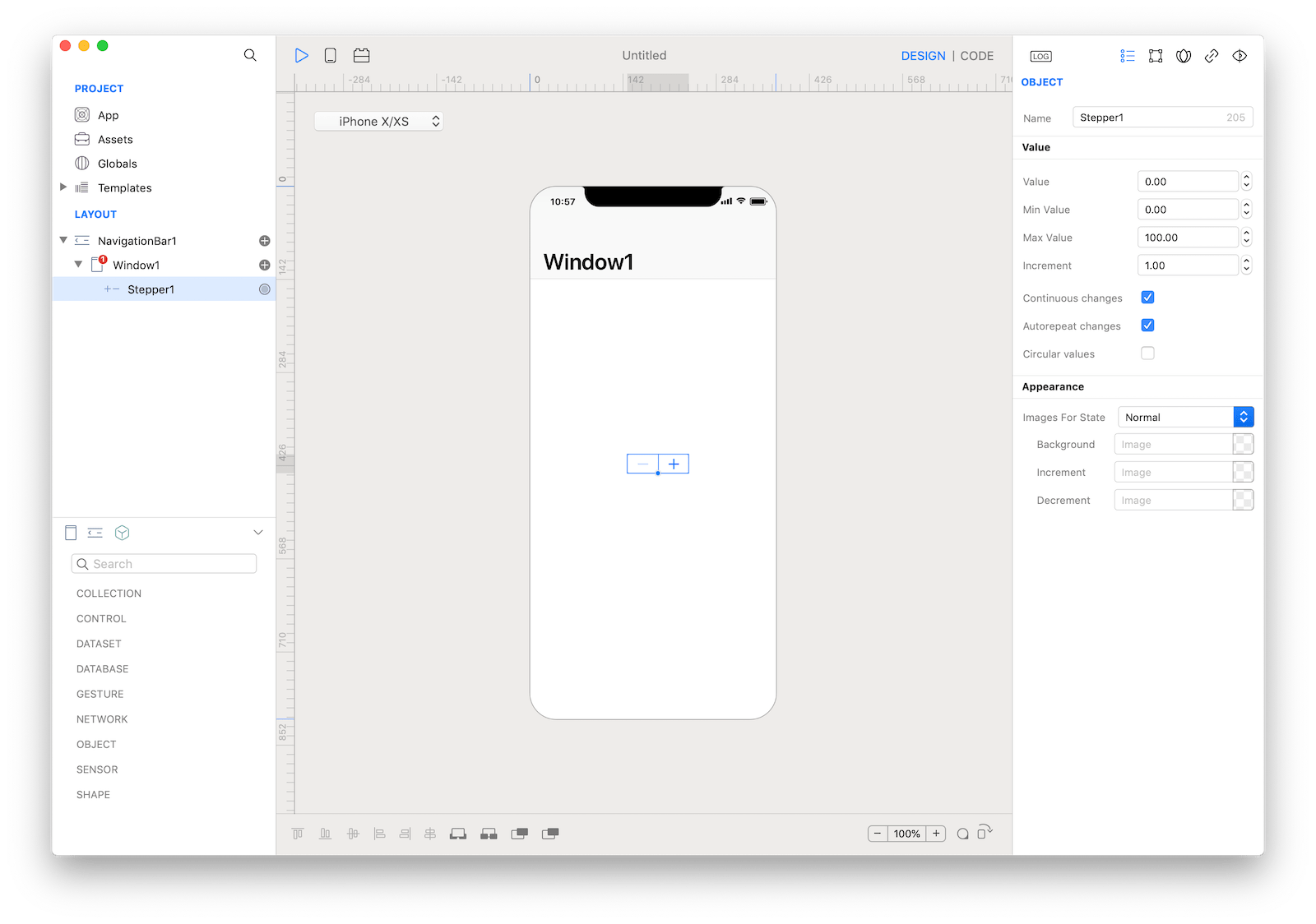
 The inspector where the
 Stepper class can be configured.
Example
- Open the
Code Editor - Select the
Changeditem inside theEventsarea and write your custom code in theCode EditorConsole.write("Stepper value: \(self.value)")
Most important properties
Several UI aspects can be configured in the Stepper class but the Value, Min Value, Max Value and Increment are the most commons to be configured.
Value: The numeric value of the stepper.Min Value: The lowest possible numeric value for the stepper.Max Value: The highest possible numeric value for the stepper.Increment: The step, or increment, value for the stepper.
References
Stepper class reference contains a complete list of properties and methods that can be used to customize a Stepper object.