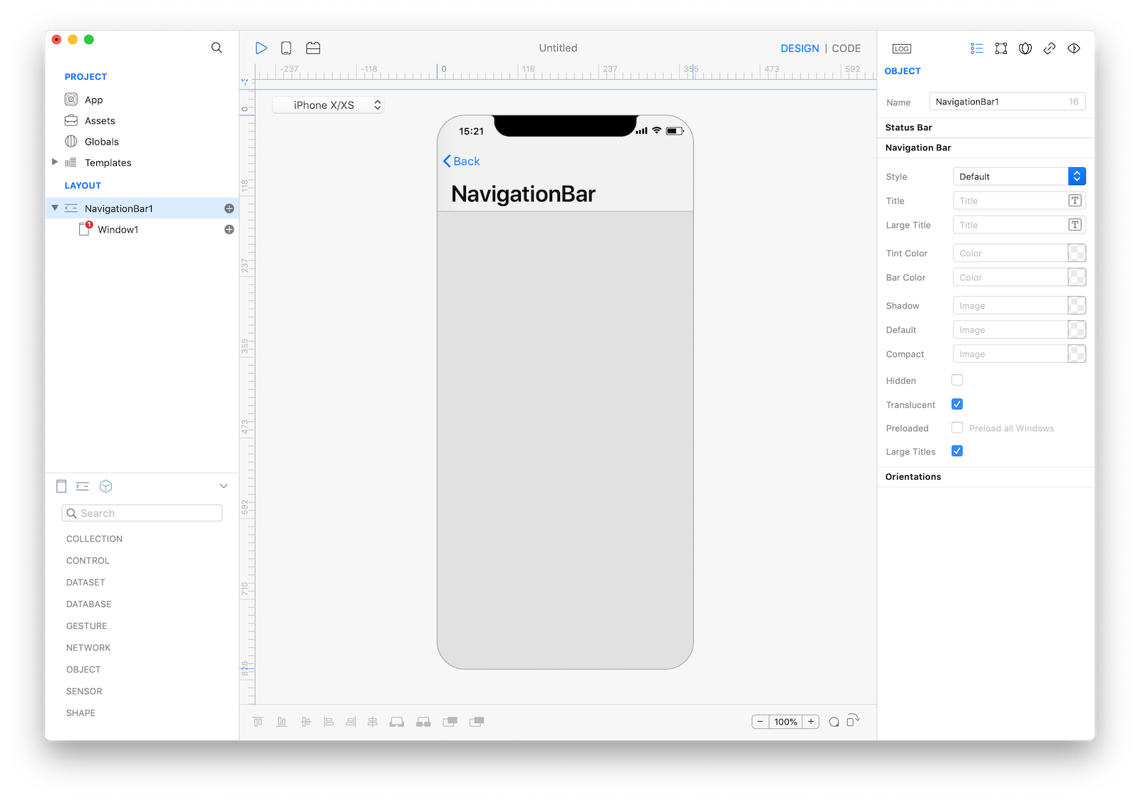
NavigationBar
A navigation bar appears at the top of an app screen, below the status bar, and enables navigation through a series of hierarchical screens. When a new screen is displayed, a back button, often labeled with the title of the previous screen, appears on the left side of the bar. Sometimes, the right side of a navigation bar contains a control, like an Edit or a Done button, for managing the content within the active view. In a split view, a navigation bar may appear in a single pane of the split view. Navigation bars are translucent, may have a background tint, and can be configured to hide when the keyboard is onscreen, a gesture occurs, or a view resizes.
Best practices
Horizontal navigation is a popular navigation pattern widely used to display hierarchical content, ie:
- the setting of an app, and the user taps an element to open its subsettings
- a social item, and the user taps a preview to open its full description and details
A common App schema is to have a root Window like a TabBar and a NavigationBar for each of its child.
If the navigation is not in a single direction (from generic to detail and viceversa) then NavigationBar may not be appropriate.
How to use
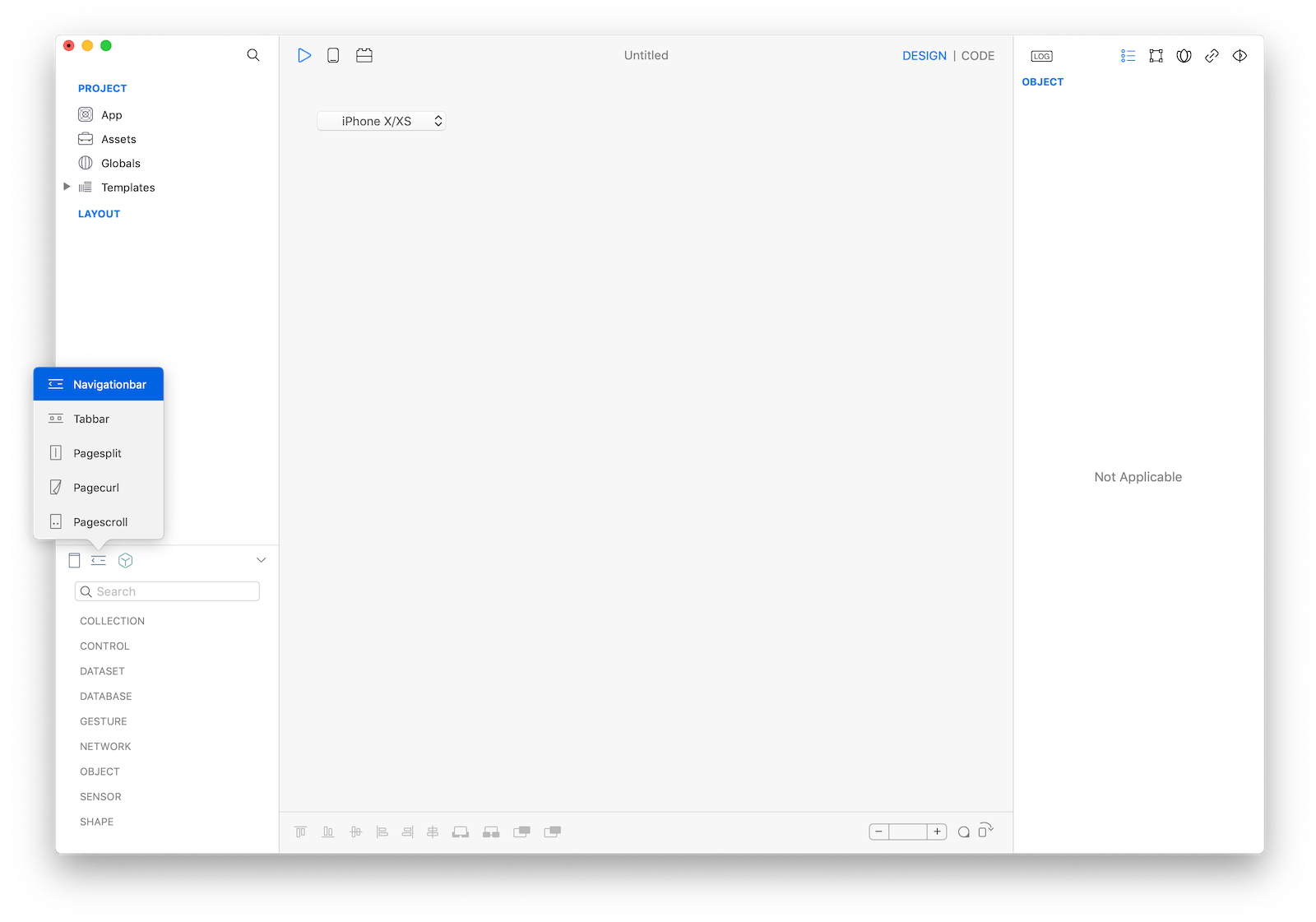
- Create a new
NavigationBarand customize its properties - Create 1 or more child
Window - For each child
Windowcustomize itsNavigation Barsubsettings (bar visibility, title, prompt and buttons) - Add or remove
Windowby code or by actions
Example
- Start adding a
NavigationBarby tapping the New Navigation button on the Objects Bar over the Objects Panel
- Configure the
NavigationBarappearance and the application hierarchy by addingWindowchild screens (ref: Window) - Configure each screen to add a
TABBAR Item - keep doing the same until you have a hierarchy like this
- NavigationBar1
  - Window1 (startup window)
    - Button1
 - Window2
 - Window3
Interacting using Gravity
To push a new Window into the hierarchy, ie from a button Action call
NavigationBar1.push(Window2)equivalent to
Window2.openIn(NavigationBar1)To pop one level:
NavigationBar1.pop()equivalent to
Window2.close()To pop to the root level:
NavigationBar1.popToRootWindow()Customize a navigation bar
The content of the navigation bar depends on the navigation-related properties of the Window subnodes.
You can customize the navigation-related properties of a Window by tapping the Window icon (+).
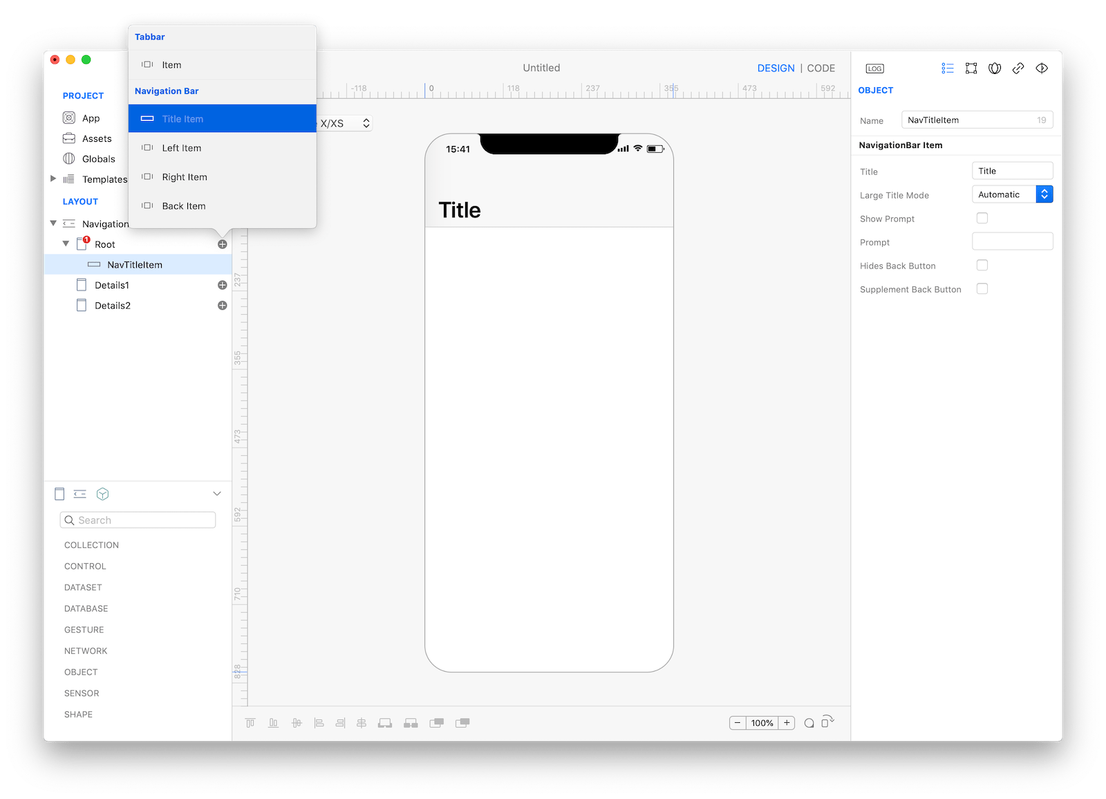
Any child Window of the Navigation Bar may have:
- A custom title
- A custom prompt
- 1 or more left button
- 1 or more right button
- A custom back button
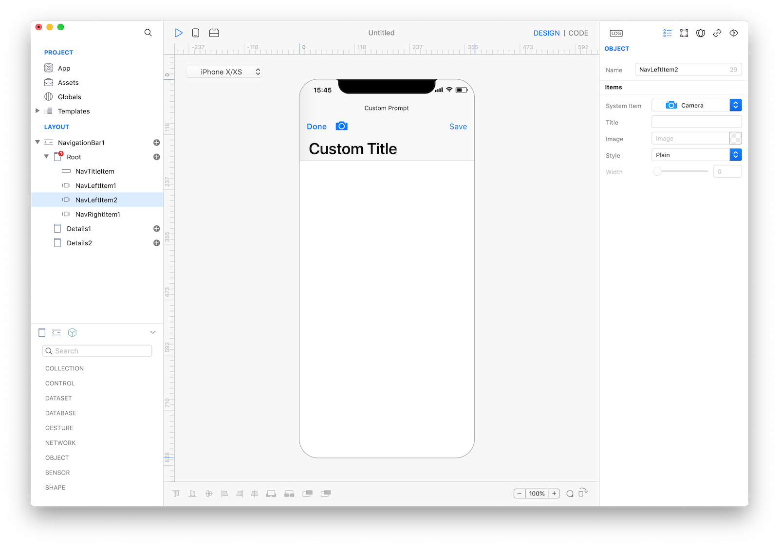
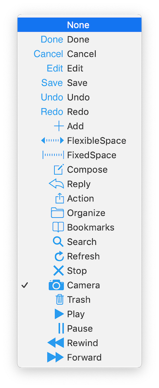
The buttons can both be custom (with a user provided title/image) or selected from the list of the iconic system buttons.
Note: without the Title subnode the title itself is automatically retrieved from the name of the current children Window.
Most important properties
Several UI aspects can be configured but the most used are:
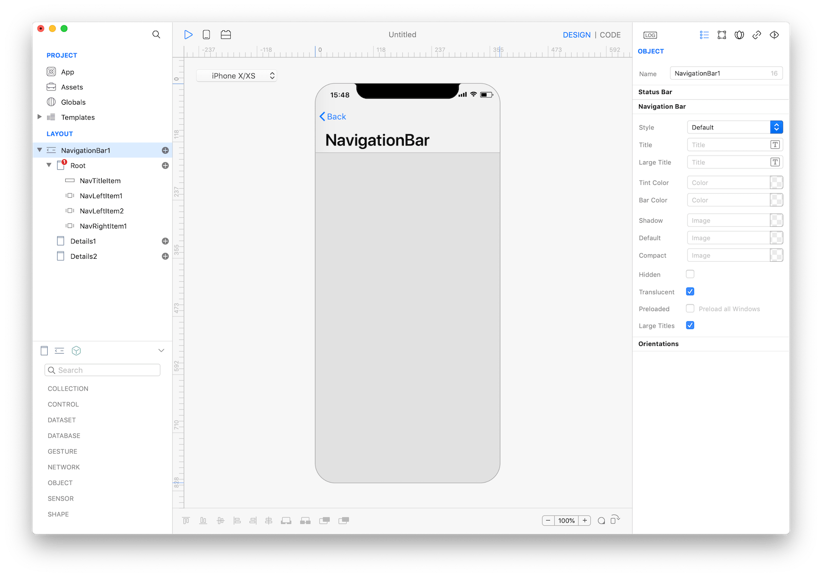
Style, white with dark text or black with light text.Translucent Navigation Bar, when set true the background is semitransparent.Bar Color, navigation bar background tint color.Prefer Large Titles, when set true the title is displayed in a large format.Hide Navigation Bar, when set true the navigation bar is hidden, usually just the root screen has the navigation bar hidden.
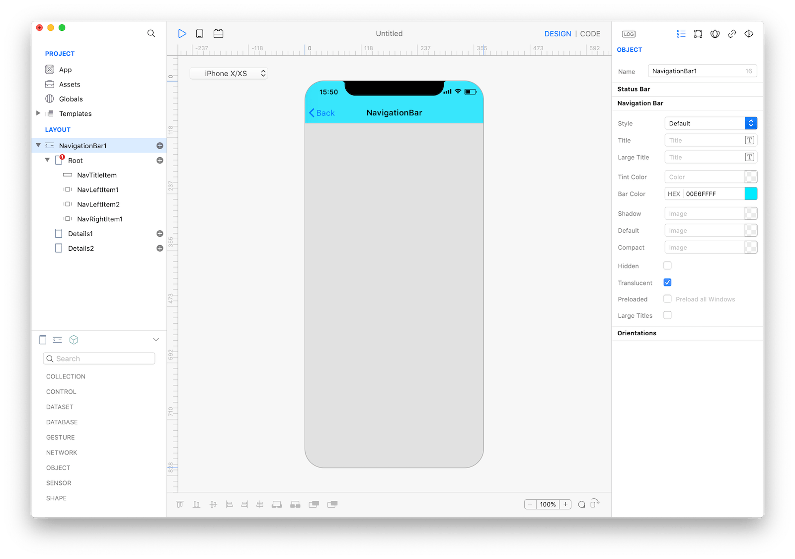 Compact navigation bar.
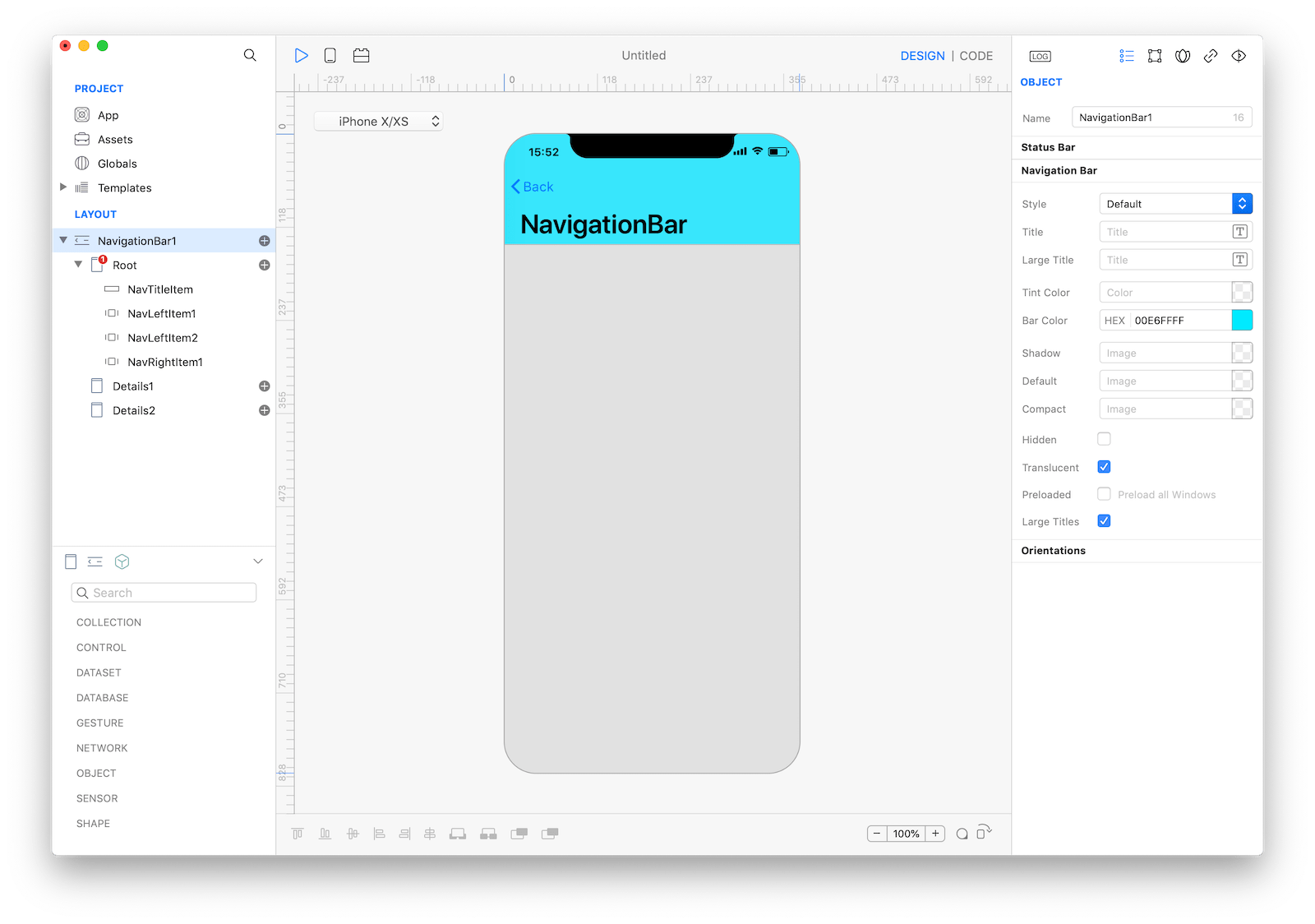 Large navigation bar.
References
NavigationBar contains a complete list of properties and methods that can be used to customize a NavigationBar object.